Solo.to, which is a link-in-bio platform, strikes a balance between simplicity and variety of functions for different users through their free and paid plans.
Key takeaways:
- There's a free plan and premium plans with affordable pricing
- Analytics data is just basic
- Free plan supports up to 25 links only
- Few theme options
My recent discovery of Solo.to has been another link-in-bio platform available online. In contrast to others though, Solo.to offers one account that doesn’t require any payment along with several fee-based plans.
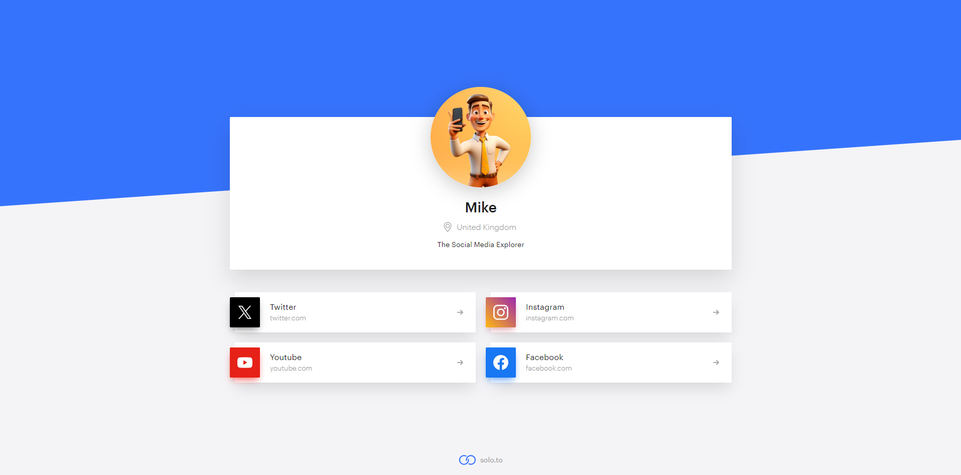
Having explored it a bit, I’m now ready to give my views and insights on this review. If you are considering Solo.to for your digital needs, feel free to read on. My findings may help you determine if this platform is right for you.
Page Load Speed
It is worth noting that Solo.to pages load in less than 2 seconds which is quite impressive compared to the industry average of 5 seconds. It is important as far as maintaining audience engagement and reducing bounce rates are concerned since today’s users expect information to be provided quickly thus even a few milliseconds’ delay can result in annoyance and disinterest.
Moreover, its speed advantage indirectly enhances search engine optimization (SEO) rankings since such engines prefer sites that load faster. Personally, fast loading time means that I can browse content more effectively.
User Interface Efficiency
To emphasize its simplicity further, Solo.to has a clear white appearance with navigation being done using the left side bar while the main area on the right gives options depending on what one chooses from the menu.
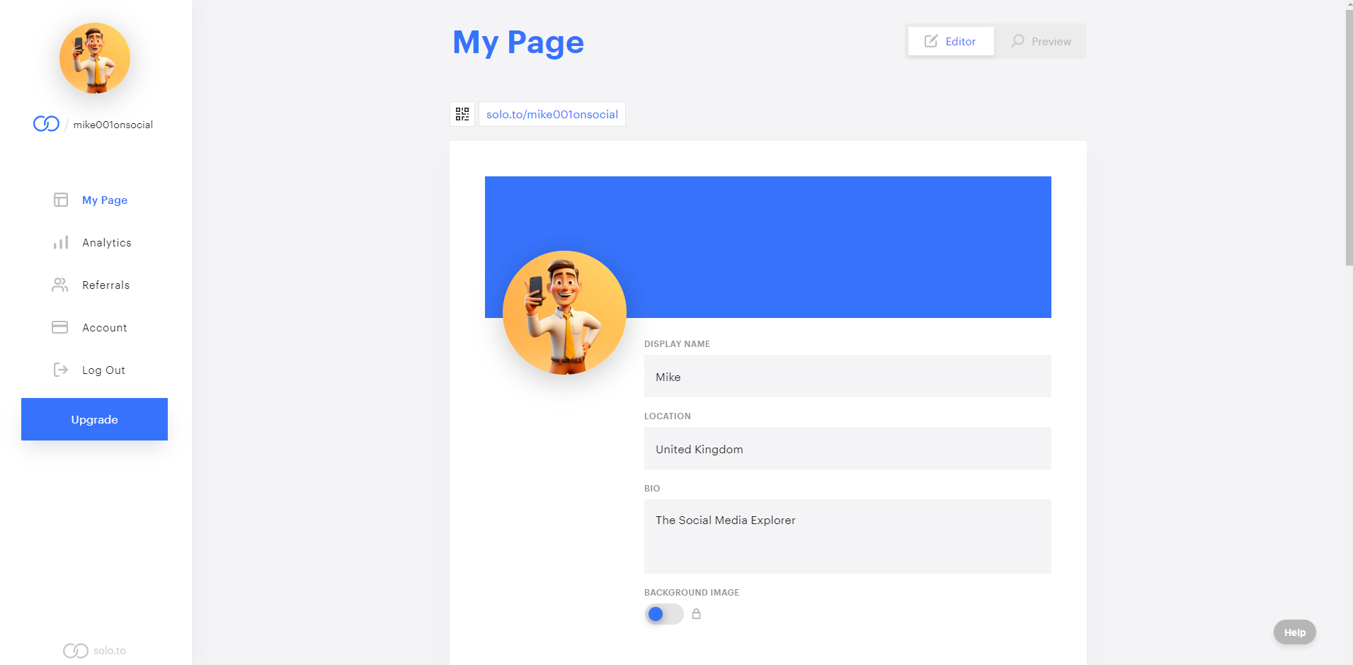
With its intuitive design, even newcomers can quickly become proficient, without the need for extensive time investment. The platform is user-friendly and doesn't require any HTML skills, allowing you to set up your link-in-bio page in just a few minutes.
Customizable Templates
Solo.to offers a somewhat limited range of theme options, with just three choices:
- Light
- Dark
- Void
While this might seem restrictive, the platform compensates with other customizable visual elements. For example, users can alter the "Accent Color," which applies to various page elements such as non-preset link thumbnails, section titles, dividers, and the email capture feature. This customization can be done through a color picker, selecting from preset color options, or inputting a hex code.
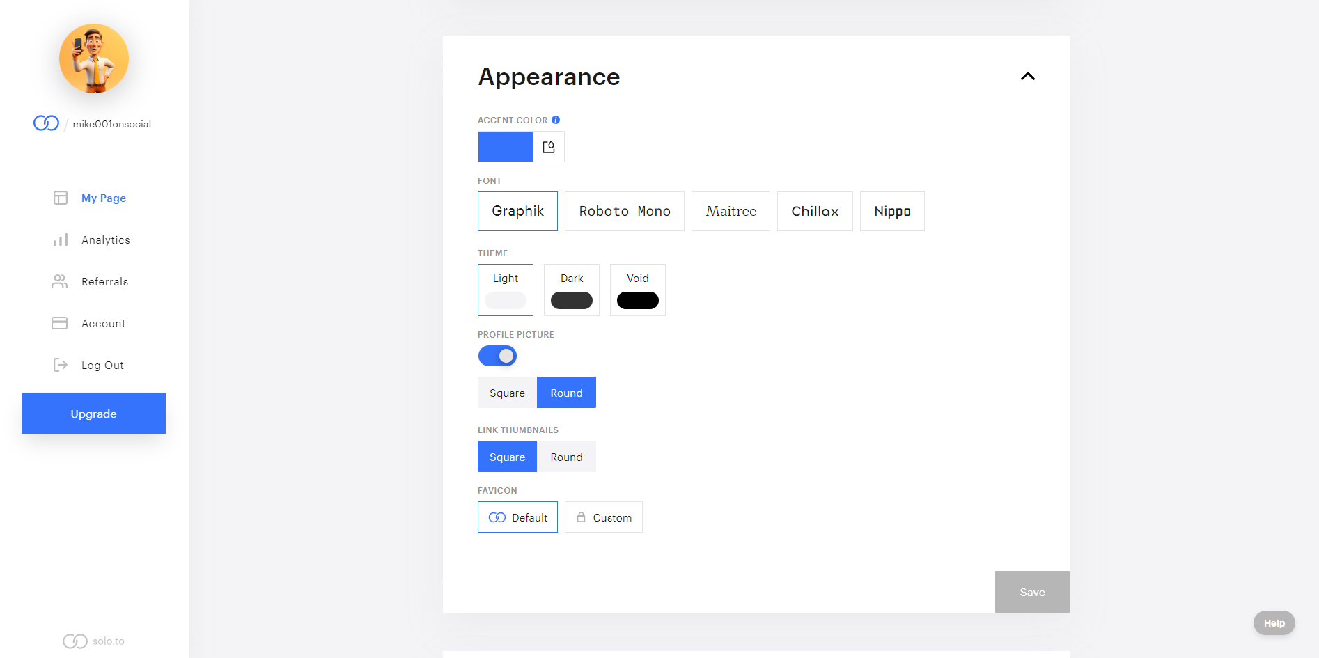
Additionally, Solo.to also provides a variety of font styles including:
- Graphik
- Roboto
- Mono
- Maitree
- Chillax
- Nippo
This allows further personalization. Furthermore, users can decide on either square or round shapes for their profile picture and link thumbnails.
Lastly, there is an option to set a favicon – either keep the default one or upload another custom favicon but this feature is only available for Professional plan subscribers. These customization features along with the limitation of themes do not offer much choice; however, they provide a great control tool over aesthetics.
Link Capacity
Adding links in Solo.to is easy by using “Links & Embeds” section. While you can have as many as 25 additional links in your free account settings, I’d advise limiting them to about 5 to 10 essential ones. This prevents overwhelming visitors with too many choices. As for Personal Plan members’ new links each can be given its own subtitle and highlighted segments.
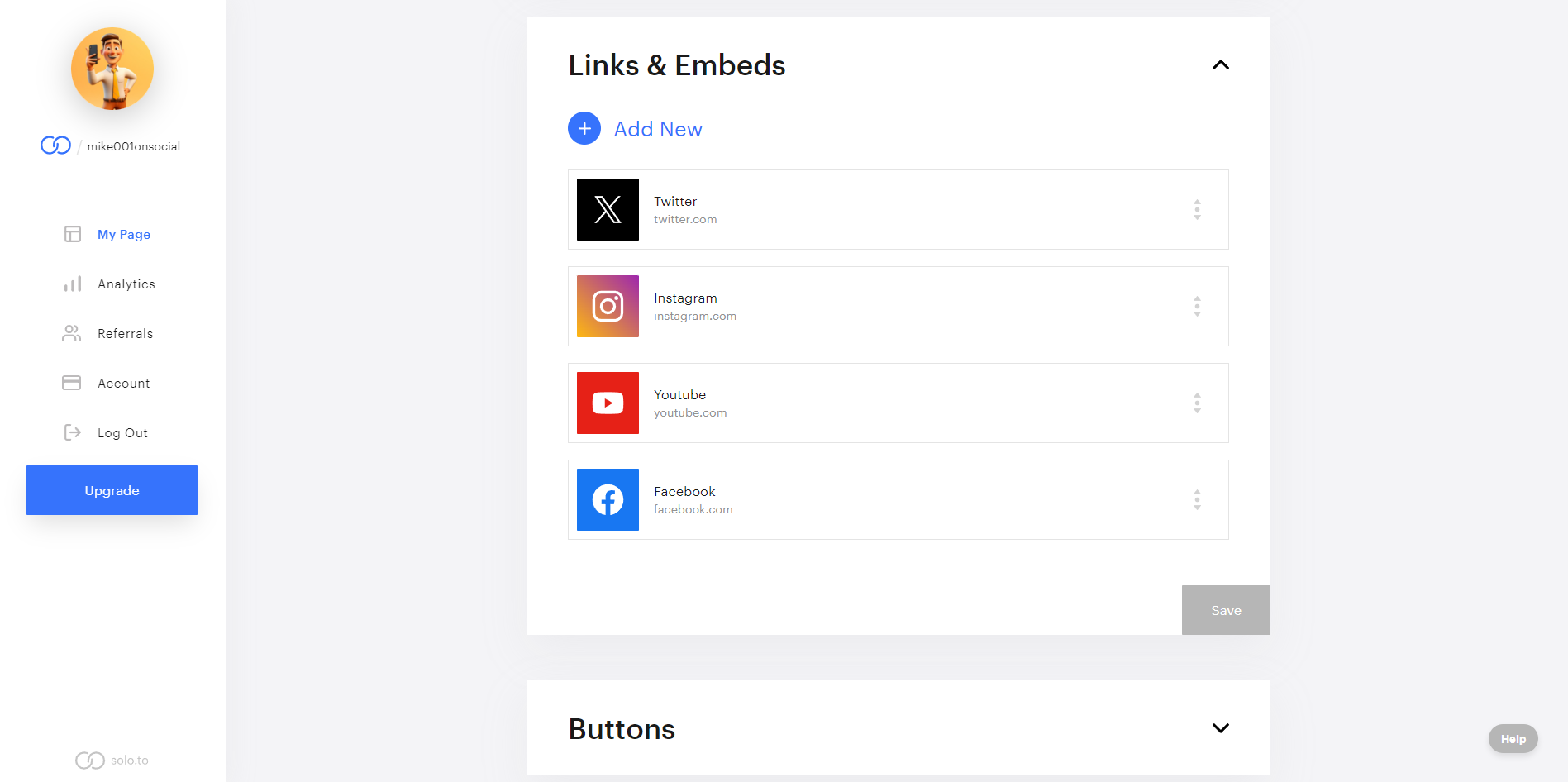
In addition, for the Entrepreneur plan there is a possibility to add custom thumbnails and schedule links that makes it more personal. Nonetheless, all these attributes require a subscription fee. It is worth noting that some of these paid features are provided at no cost by competitors such as Linktree. This discrepancy might sway clients’ choice of service especially those in need of extra special features without any extra charges.
Analytics Precision
Analytics feature is available on Solo.to for all types of account. However, the Beginner Plan has limitations to only current day’s views and all-time view counts. More detailed information like link clicks is reserved for Entrepreneur plan users only.
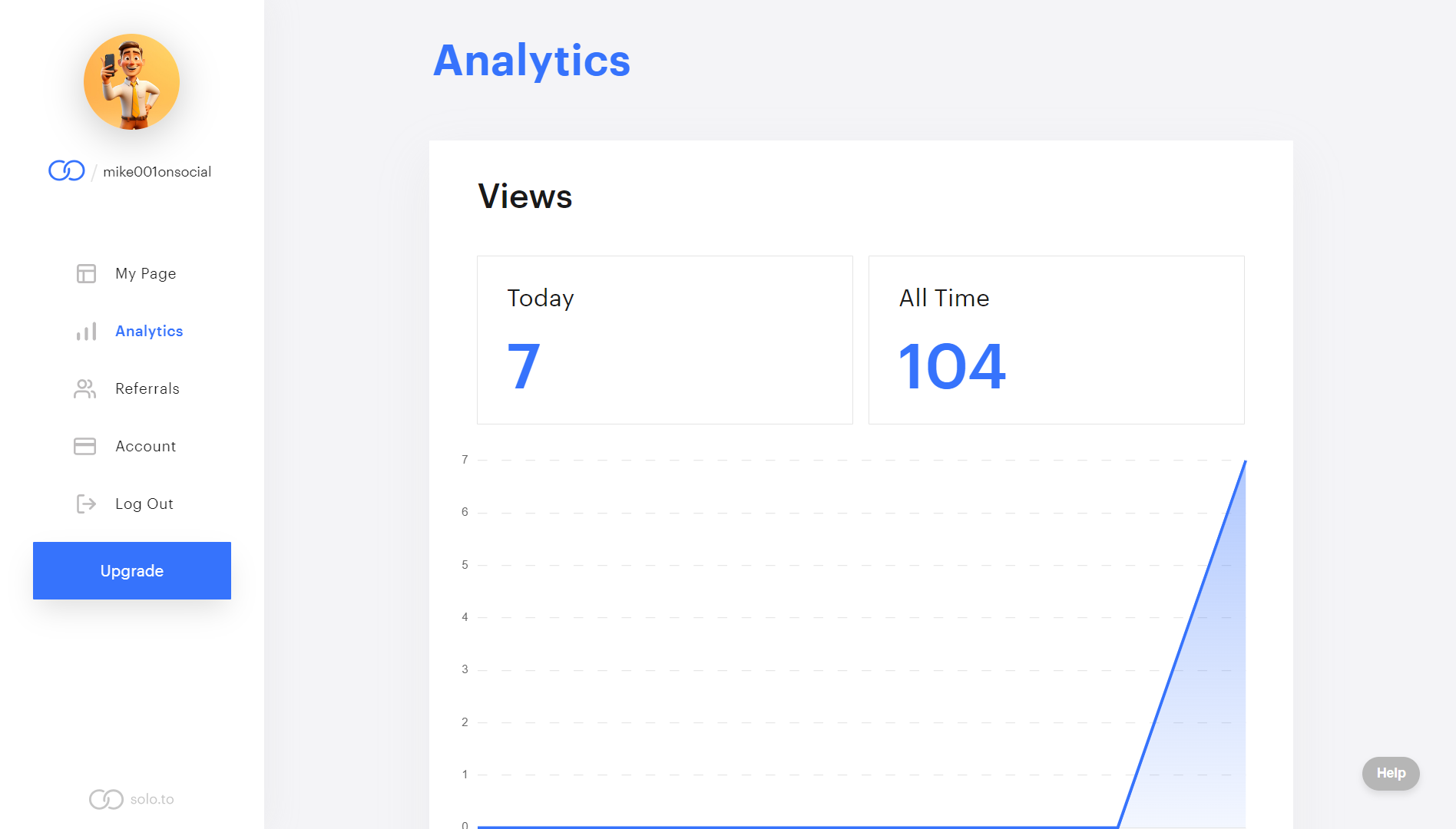
For basic users, this might not be a significant issue, but those seeking more in-depth analytics will need to consider their options. This distinction in analytics access might influence the choice between sticking with the basic plan or upgrading for more comprehensive data tracking.
Mobile Responsiveness
Since mobile usage has become popular, the world needs such kind of responsiveness that is shown by Solo.to so that both their clients and followers can effortlessly open link-in-bio pages from any device.
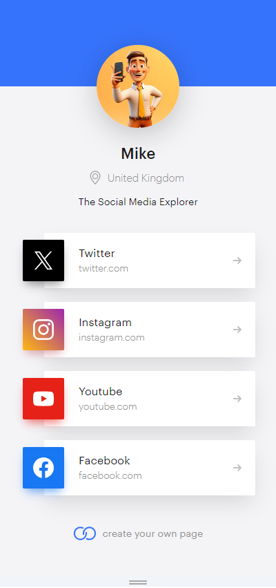
In fact, Solo.to looks good on any screen size because it is tested on various mobile devices such as smartphones and tablets. This device adaptability which enhances user experience, makes Solo.to a trusted platform for easy access.
Uptime and Reliability
This efficient and lightweight design makes Solo.to perform well when it comes to audience responses. Therefore, solo.to guarantees that your page will load quickly thereby ensuring that the viewers remain engaged always. Its reliability and uptime also mark it as a solid option for professionals and content creators who require consistent availability, minimizing the risk of downtime. In summary, these aspects make it a noteworthy choice for those seeking efficiency and dependability in their online tools.
Affordability
The pricing plans offered by Solo.to are as follows:
- Beginner Plan: This consists of at most nine basic users with free services including up to twenty-five custom links, contact buttons, page themes plus section dividers, unique solo.to link and custom profile image; basic analytical data for one week; responsive page designs; double security protection background color customization abilities.
- Personal Plan: For those who want more features while spending less money on them this plan offers everything on Beginner Plan along with up to 50 custom links, social buttons, section titles beside highlighted links among others an animated profile picture like basic analytics lasting one month.
- Entrepreneur Plan: Another popular plan includes all of Personal Plans features but adds two pages embeds (videos), music etc.), ability to customize thumbnails alongside your links as well as hundreds of other links & embeds action social buttons enhanced link SEO scheduled linking page cloning advanced six months analytics.
- Professional Plan: The most complete plan has all of Entrepreneur’s incentives in addition to five pages contact capture priority support link searching personalized favicon domains meta pixel tracking collaborator access optional solo.to branding advanced twelve months analytics.
| Solo.to Plan | Cost Per Month |
| Beginner | Free |
| Personal | $1 |
| Entrepreneur | $5 |
| Professional | $10 |
I advise basic users to go for the Beginner Plan because it has some essential features free of charge. If you want extra features at a very low cost, then Personal plan is best priced at only $1 per month.
Customer Support Response
The dashboard comes with an AI chatbot which is able to handle simple concerns effectively. I decided to ask a few direct questions and it gave me in-depth and relevant answers.
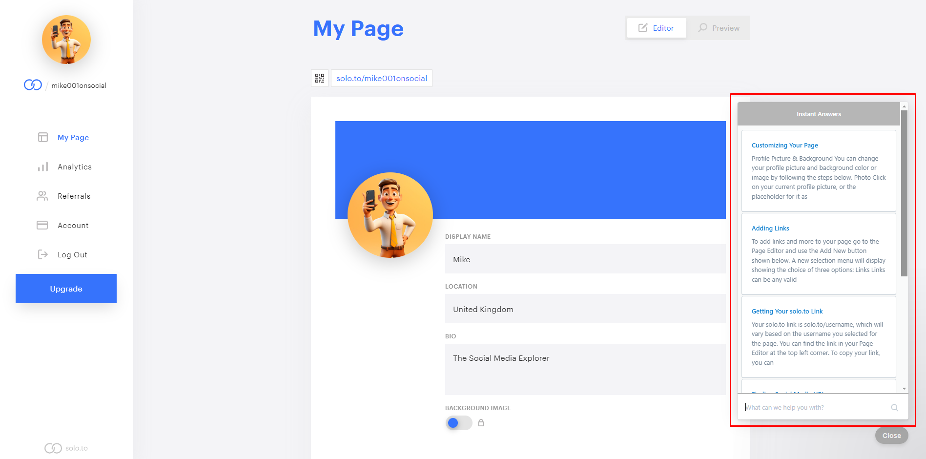
For direct communication with customer support, live chat is available through the dashboard. The user can click on the “Help” button at the bottom-right corner of the screen and select “Ask” to start a conversation. In case you find that the live chat is off line, you are free to drop a message.
From my previous interaction, I have realized that using this interface will make their support staff get back to me in 12 hours. Moreover, they also send their answers into your email hence giving an opportunity to respond via email or by using live chat.
Pros & Cons
Pros
- User-friendly interface for easy navigation
- Mobile optimized for consistent access across devices
- Offers basic analytics for performance tracking
- Affordable pricing with a free plan available
- Integrates well with social media and music platforms
Cons
- Limited customization with few theme options
- Advanced features require paid plans
- Basic analytics may not suffice for in-depth insights
- Supports up to 25 links only for the free plan
- Lacks some functionalities offered by competitors
My Verdict
The user interface of Solo.to looks very simple, with white color scheme occupying minimal space on the screen–a sidebar at left hand side for menus and buttons while most operations take place within the large right part. Its user-friendliness allows even starters to navigate through it without strain thus becoming experts within short periods. By not requiring HTML knowledge, one’s link-in-bio page can be made quickly. These characteristics render Solo.to an amazing alternative for people looking for time-saving experiences that come without hassles.


