Milkshake has an app that allows you to set up a link in bio on your phone but you won't be able to access or edit your account on a web browser.
Key takeaways:
- Everything can only be done using the app.
- There are only 16 designs to choose from.
- Insights (analytics) are very detailed and useful for monitoring website performance.
- A $2.99 monthly fee is required to remove the logo and branding.
- It uses the domain "msha.ke".
I've been on the lookout for platforms that are not just user-friendly but also unique, making setting up a link in bio a breeze, which is why I decided to give Milkshake a whirl. This app claims to make the entire experience "fun, easy, beautiful, and instant," which piqued my curiosity. I’ll be sharing my firsthand account of how Milkshake distinguishes itself—or doesn't—from other brands I've tested. Let's explore what makes it unique and whether it operates smoothly or not.
For starters: it's an app
Unlike other link-in-bio platforms, Milkshake's online services can only be used via its mobile app. While it does have a website, I learned that opening an account and setting up the bio link can only be done through the application. That means if you don't have a phone, then you won't be able to use this service.
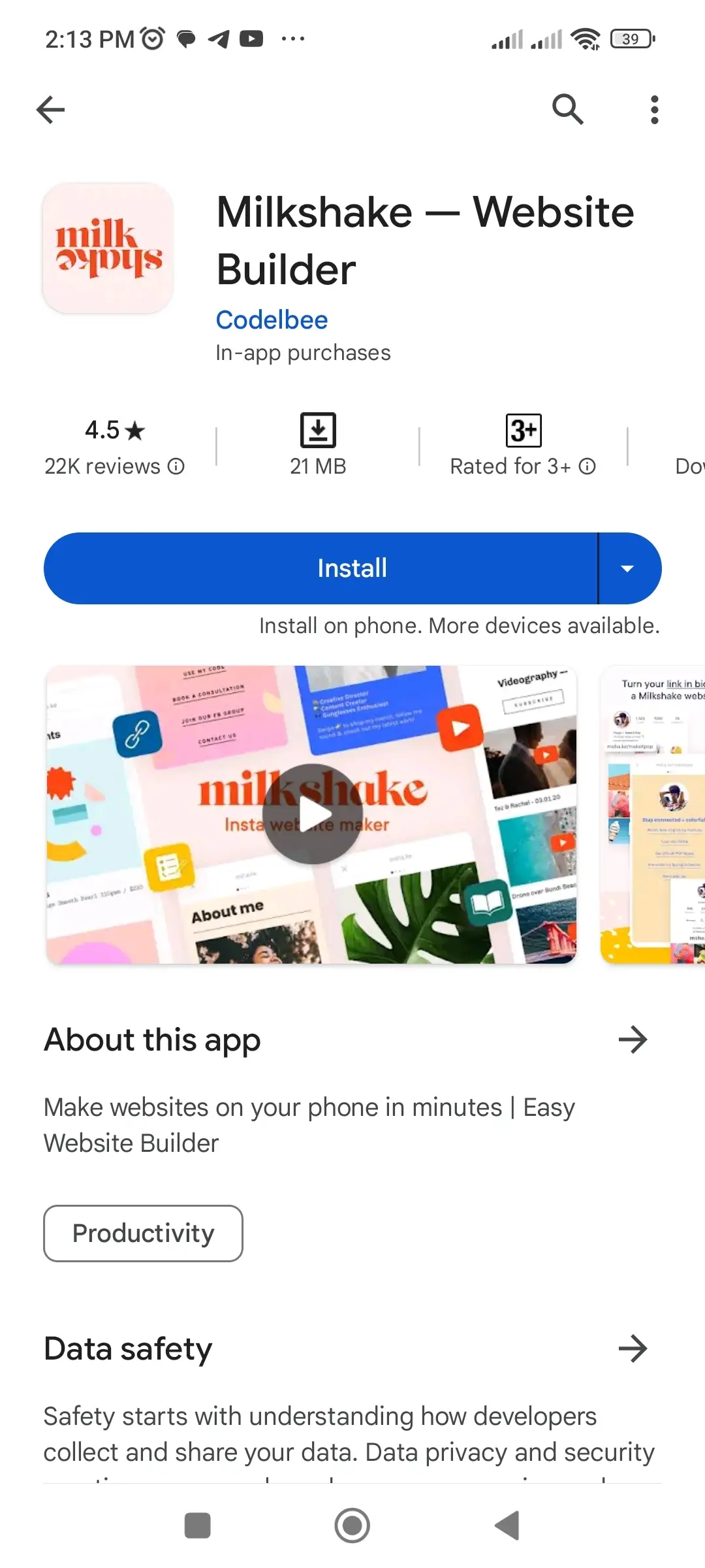
And if you do have one (which most likely you do), simply search for "Milkshake — Website Builder" on Apple's App Store and Google's Play Store. You can also just click on the links I added, which will directly take you to the app download page. The file size ranges from 20 to 40 MB so it won't take a lot of your device's storage.
| Mobile Operating System | Application Store | Compatibility |
| iOS | App Store | iOS 12.4 or higher |
| Android | Play Store | Android 7 or higher |
Milkshake is one of the very few link-in-bio platforms that offers an app, and while I find this to be an advantage for mobile phone users, there's also a downside because there's no option to access or configure the account on a web browser.
Opening the Milkshake app for the first time
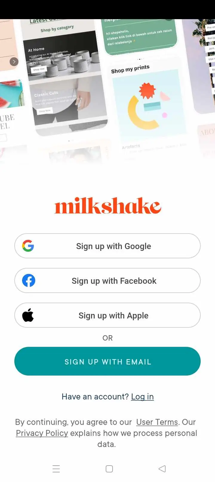
After downloading and installing the app on my phone, which took less than a minute, I immediately opened it. The welcome screen asked me to either log in or sign up for an account. Since this was my first time using it, I chose to sign up.
As a user who always prefers convenience, I was glad to learn that the registration process could be completed not just by the standard email and password method, but also by signing up using third-party accounts including Google, Facebook, and Apple. This saves me the hassle of clicking on verification links sent to my email or remembering passwords. In this case, I decided to sign up via my Google account.
The next step: picking a card
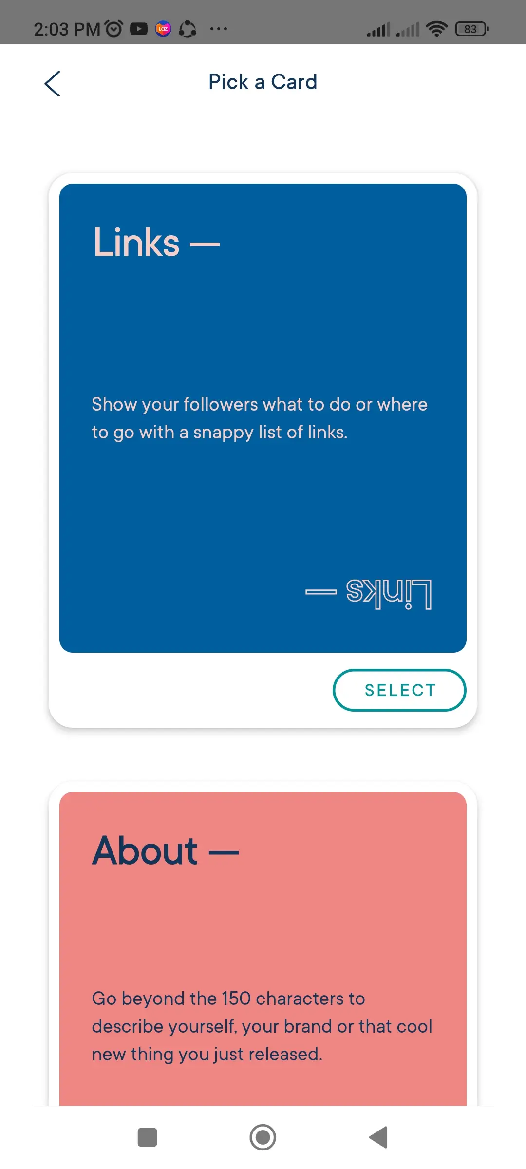
Right after signing up, I started building my bio link, which began with picking one of the following cards:
- Links: As the name suggests, it's a page where I can add a list of links.
- About: This is similar to an "About Us" or "About Me" page.
- Top Picks: It's a page for listing my favorite things, hobbies, and other top preferences.
- Splash: This page is ideal for showcasing my creative side. I can add a promo, an image, or some quote with a call to action here.
- YouTube: It's basically a space for placing a YouTube video or for promoting my YouTube channel to gain more followers.
Since my goal was to create a bio link page, I picked "Links" as it was the most suitable card for me.
Time to pick my "look"
Clicking on "Links" took me to a screen where I was asked to pick a look, which is essentially the template design catalog. During this test, I was presented with 16 options:
- Cool, Calm + Collected
- Paradise City
- State Of Grace
- Black Canvas
- Be Zine
- Avo Of My Eye
- Rose All Day
- Wanderlust
- Higher Ground
- Feelin' Dandy
- Just My Luxe
- Mister Ziggy
- Rise n Shine
- Follow My Lead
- Go With The Flow
- Ex Oh Ex Oh
Noticed the names of these template designs? Their creators were most likely inspired, and I really find them interesting. It feels like browsing through a real catalog, as if I were planning to paint a wall or redecorate my room. This was a very creative and clever approach.
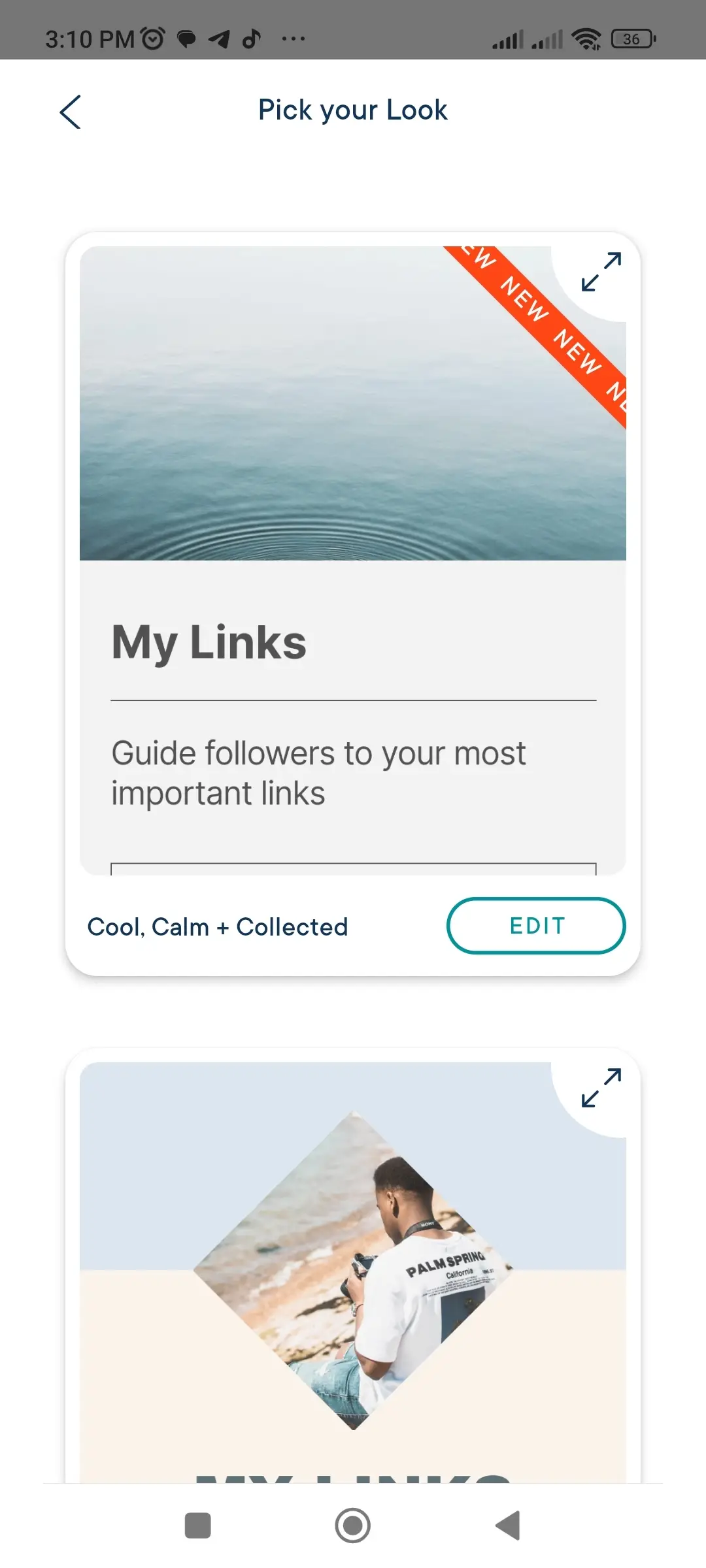
I might have been impressed with their creativity, but not with the limited number of available designs. In addition to that, I noticed that most of the looks use the same palette of pastel colors. Adding more variety would have made it a lot more interesting.
The simple process of editing my content
As soon as I selected my preferred look, I began editing my content. This included my profile photo, card heading, subheading, and description. Everything here was pretty basic and doesn't require much explanation.
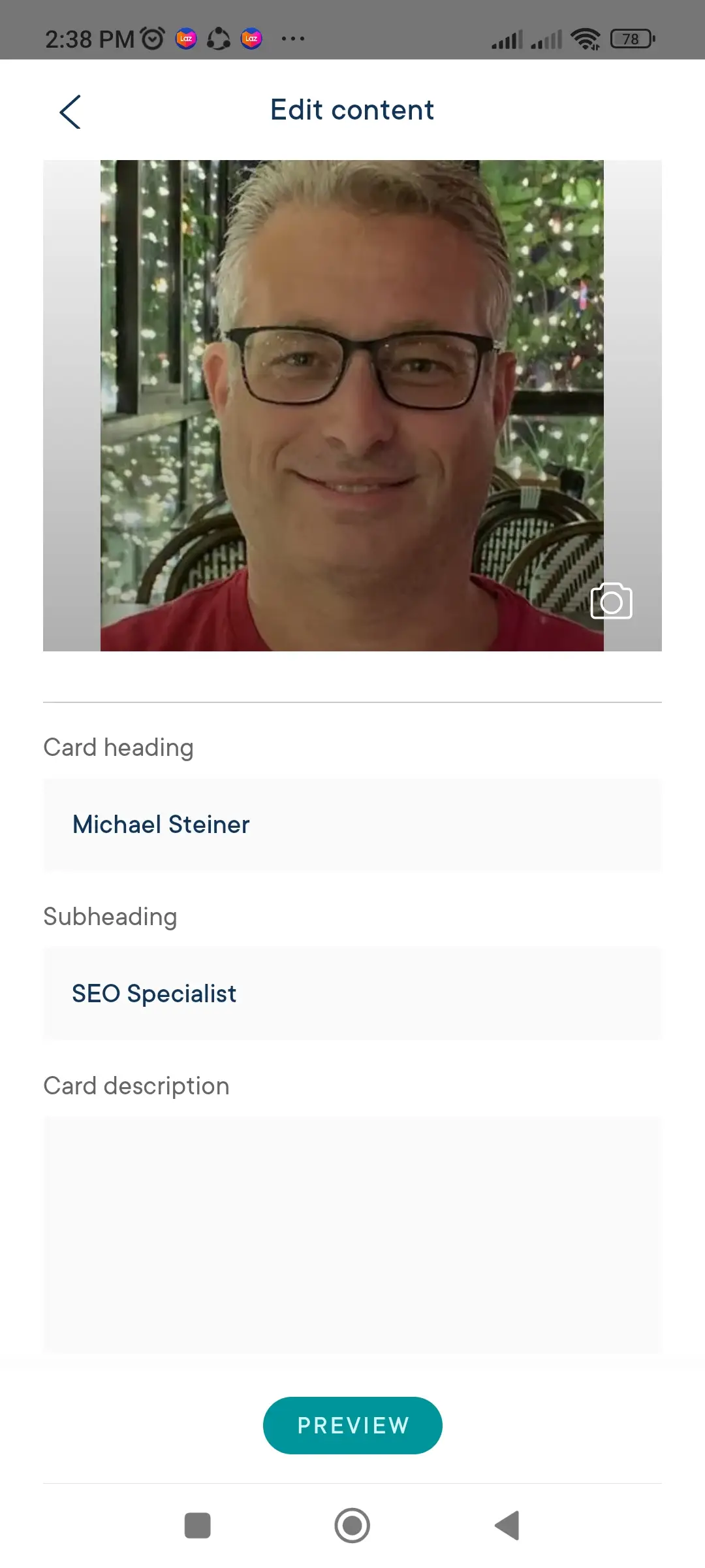
The lower part of the screen involves adding my links, and there are two types of sections:
1. Links: These are for basic links such as websites, blogs, or stores.
2. Social Links: As the term suggests, this section is for adding all of my social media profiles, streaming platforms, and ecommerce sites, including the following:
- Email address
- X (Twitter)
- Threads
- Mastodon
- YouTube
- Spotify
- TikTok
- Snapchat
- Discord
- Twitch
- Telegram
- Shopee
- Lazada
The thing with these supported social links is that the system automatically assigns the platform's official icons to them on the profile. While this is a good feature, the only downside is that if I have an additional social link not included in the list, then it won't be assigned an icon. That leaves me with the option of either putting it under the basic Links category or simply not including it in this list.
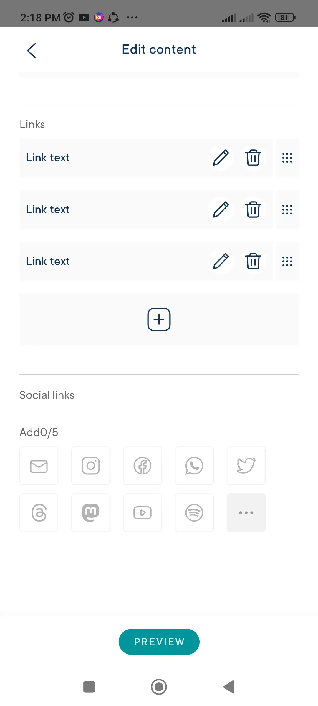
I also learned that the bio link page will only accept a maximum of five social links. There was no way to add more than that, so if you have plenty of social media profiles, this could be disadvantageous to you.
Job done! My Milkshake bio link is now published
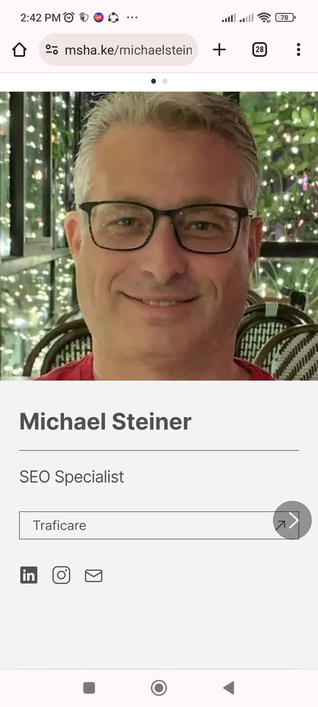
Because I'm editing my profile on the app, I already have an idea of how it will look on mobile, and true enough, it looked just as it did while I was configuring it when I viewed it on my mobile web browser. Take a look:
Now, I was curious about how it would look on a desktop or laptop, so I decided to access it on my Mac's web browser, and this is how it appeared:
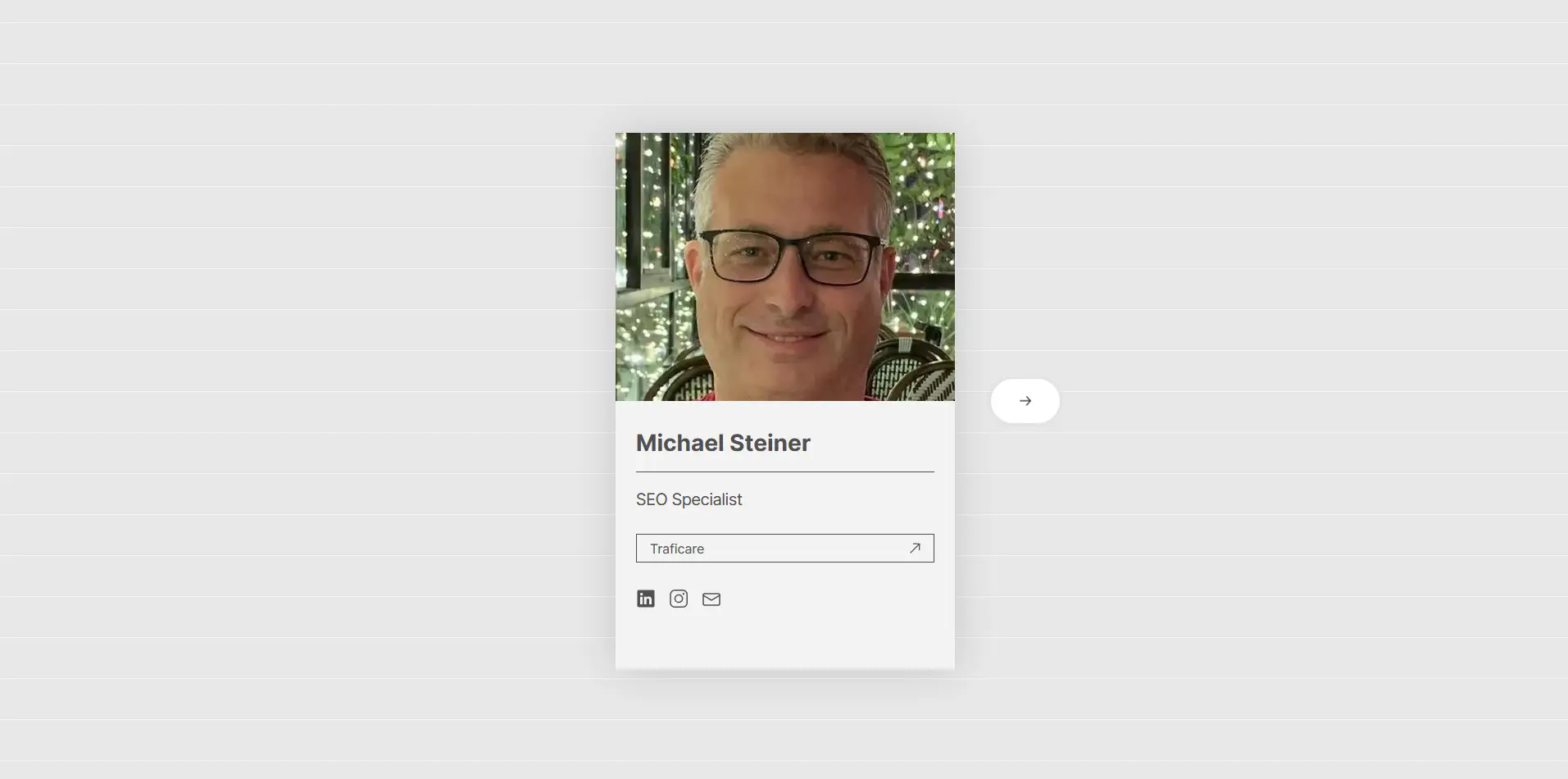
To be honest, I wasn't really impressed with the desktop version because it looks so compact and has a lot of wasted space. It would have been better if they had removed the small box and adapted it better for larger screens. Platforms like Hopp and Linktree have done this better.
Curious to see my profile on your browser? You can check it out at msha.ke/michaelsteiner.
Also, if you notice the URL, the domain they use is msha.ke, which doesn't really resonate with me. Yes, I could easily share this link by sending the address to my contacts or audience, but saying it aloud is a bit difficult.
For example, I could either say "m-sha, dot k, e, slash, michaelsteiner," or spell it out character by character like "m, s, h, a, dot, k, e, slash, michaelsteiner." See how complicated it is? That's the downside of it.
Live chat support response takes more than a day
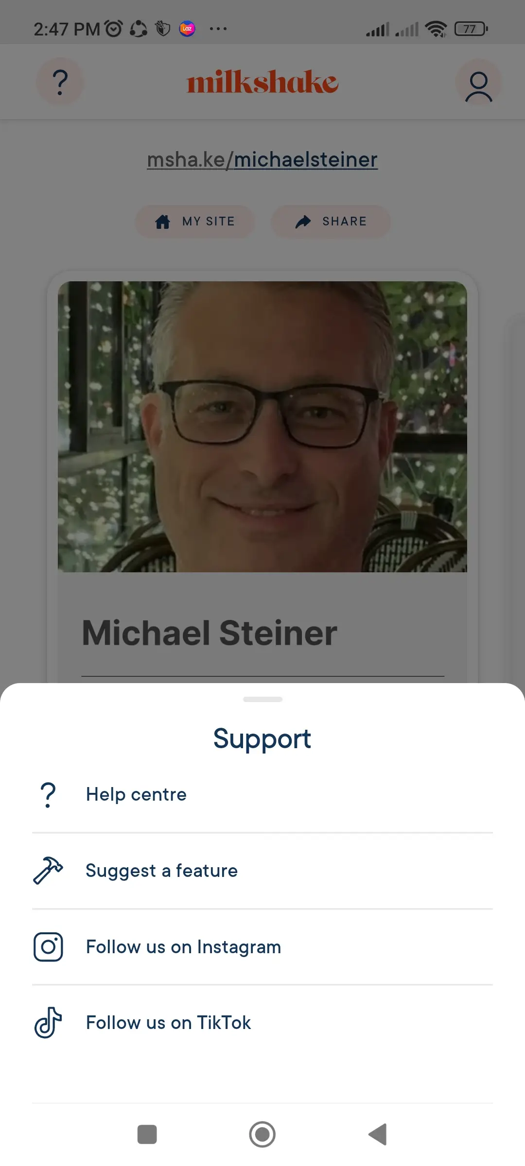
I learned that the app's Support menu can be accessed by clicking on the question mark icon (?) located in the upper left-hand corner of the screen. This presented me with options to access the MilkShake Help Centre, suggest a feature, or follow them via their official social network pages.
I was able to get in touch with their customer support through two mediums:
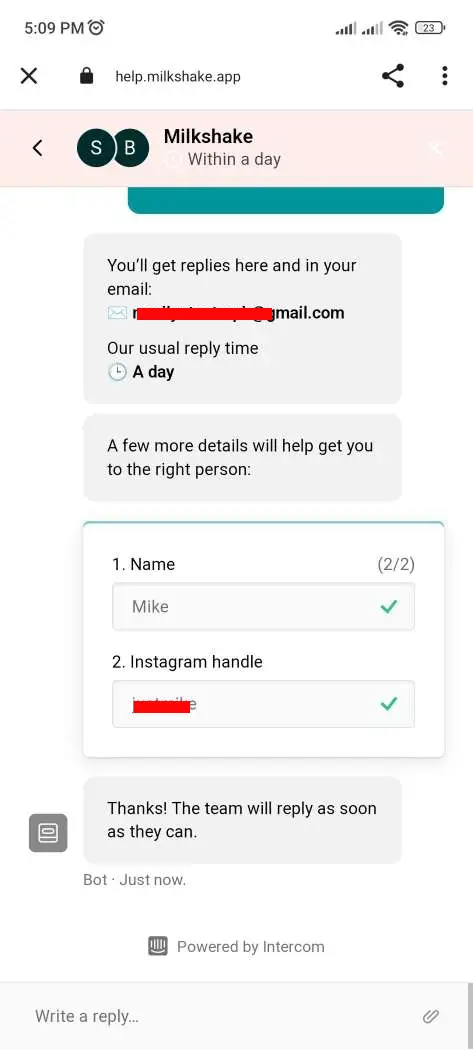
1. Live Chat: While this is the most direct way to ask questions, it's not the fastest option. I decided to start a live chat for personalized assistance, but during the times I made inquiries, their live agents were not available, so I left them offline messages. I received responses from them the next day.
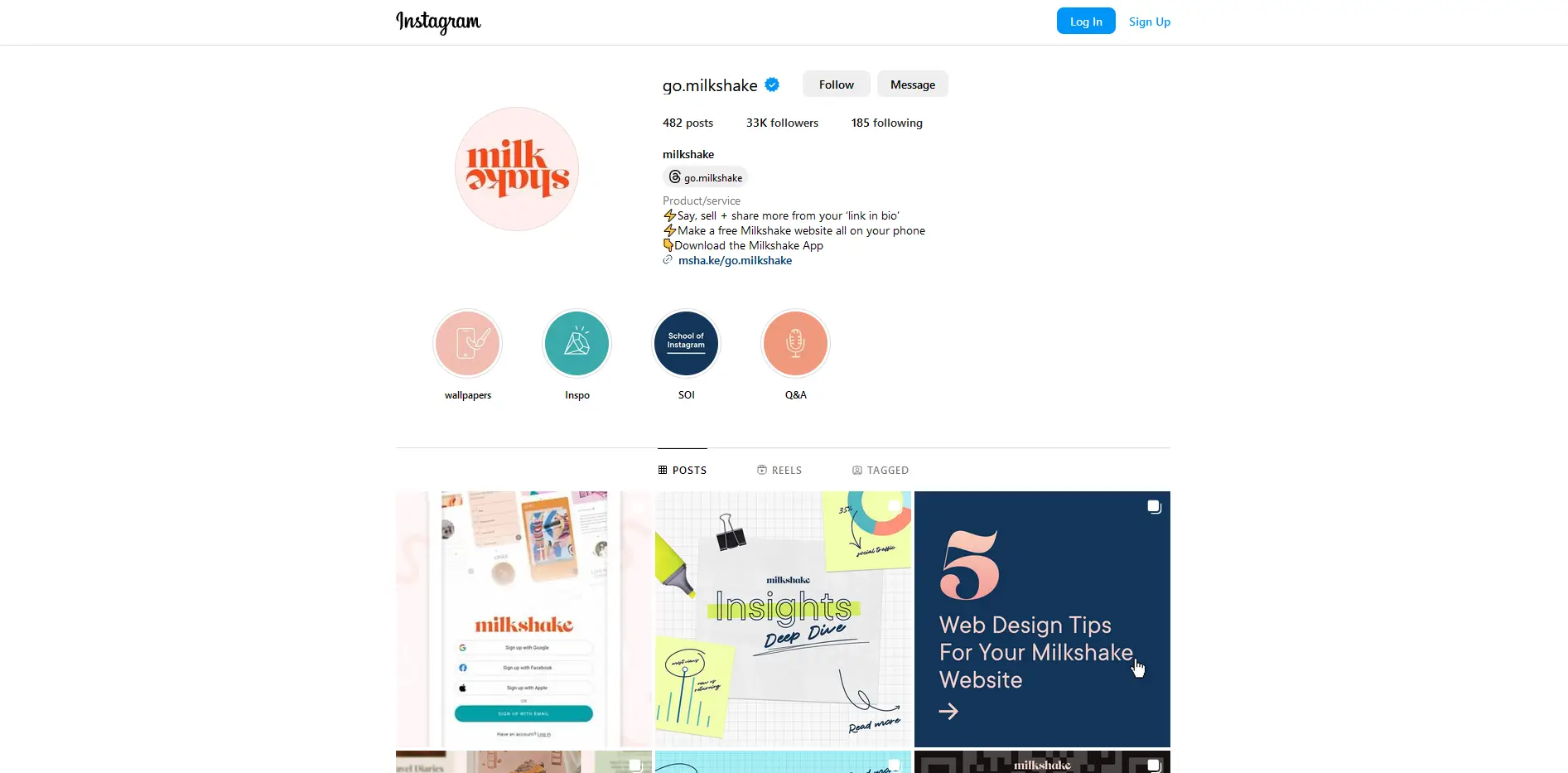
2. Instagram: Since I use Instagram, I sent them a DM to their @go.milkshake account. Here, I noticed that they reply much faster. It didn't take just a few minutes but typically within several hours, which is much faster compared to live chat.
Their analytics is called "Insights" and it's very detailed!
It's nice to know that the free account also offers basic analytics, which they label as Insights. This feature is directly accessible from the main menu. It presented me with data based on either a 7-day or 30-day period. This section is quite interesting because the stats are very detailed:
- Clicks: This shows the number of links and socials clicked, including a breakdown with graphs.
- Views: Indicates the daily view of my card, with graphs as well.
- Top Traffic Source: Shows the number of traffic sources.
- Top Locations: This shows the top 10 countries that visited my profile.
- New vs. Returning: There's also a comparison of the number of first-time viewers and returning users.
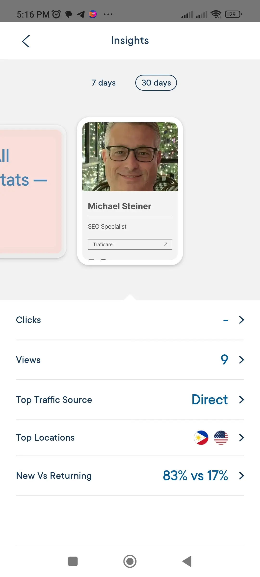
Overall, I was very impressed with their Insights feature, and it's surprising that they provide such detailed data even for non-paying users.
Use it for free or pay $2.99 a month
As you've noticed, the Milkshake account I opened is on the free plan, and the only catch is that all of my websites and cards come with Milkshake branding, which will be shown on the next screen. The thing is, it actually doesn't even appear on any of the default pages, so my visitors won't even see it unless they click on the right arrow to load the second page where the branding is.
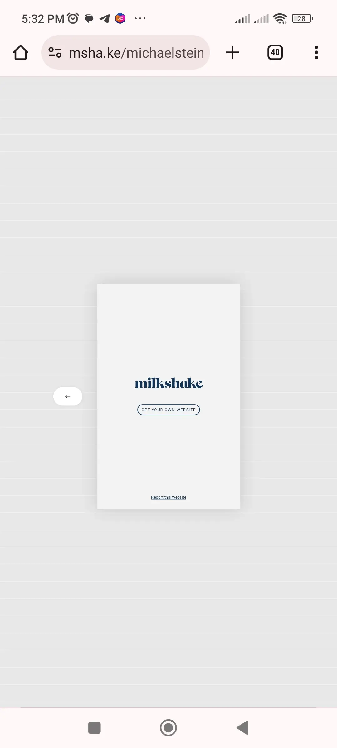
If you're using a link in bio for personal use, then this might not be a big deal. However, if you're an influencer with a significant number of followers or running a business, then you might want to remove this branding. In that case, you'll need to pay a fee of $2.99 a month. It's a bit pricey, so consider your budget for this because they don't offer a yearly plan that could provide a discount.
Pros & Cons
Pros
- Has an app for Android and iOS users
- Profile looks good on mobile screens
- Very detailed insights (analytics)
- Support can be contacted directly via Instagram
Cons
- Requires access to the app to setup or configure the account
- Designs are limited and use the same palette
- Profile doesn't look good on desktops
- Some social links are not supported
- Live chat takes more than a day to respond
- Fee for removing Milkshake's branding is costly
My Verdict
Overall, Milkshake is a mix of pros and cons. The limited number of designs was a disadvantage, plus the $2.99 monthly price tag for removing their branding makes me want to think twice. However, it also has some pretty cool features, including detailed analytics (Insights) and the convenience of being able to access it via a dedicated app.If you can live with being able to edit your link in bio only via the app and settle with the limited designs, then there's no harm in setting up a Milkshake bio link. Otherwise, you might want to consider other options.


