While Taplink offers over 200 link-in-bio designs with animations, these are not ideal if you're running a business or building a professional portfolio.
Key takeaways:
- Some of their templates come with animations and visual effects.
- You can create your own QR code for users to scan and access your page.
- The profile link uses a .cc extension which sounds weird.
- Using the Basic plan won't allow you to use icons for your links.
Still can't decide which link-in-bio site to use for all your websites and social media links? You're not alone. There are plenty of options out there, and one of them is Taplink. I discovered this brand while searching for link-in-bio platforms on the internet, so I decided to give it a try and see if their features match my needs. Please note that what I'm about to share is based on my actual experiences, so you're going to get an honest insight into what I think about this brand.
The initial step is to register for an account
In most cases, the first step in testing a service or an app requires signing-up for an account and this is the same case for Taplink. At first, I tried to access taplink.com but this took me to an IIS Windows Server page. Turns out, this wasn't their website.
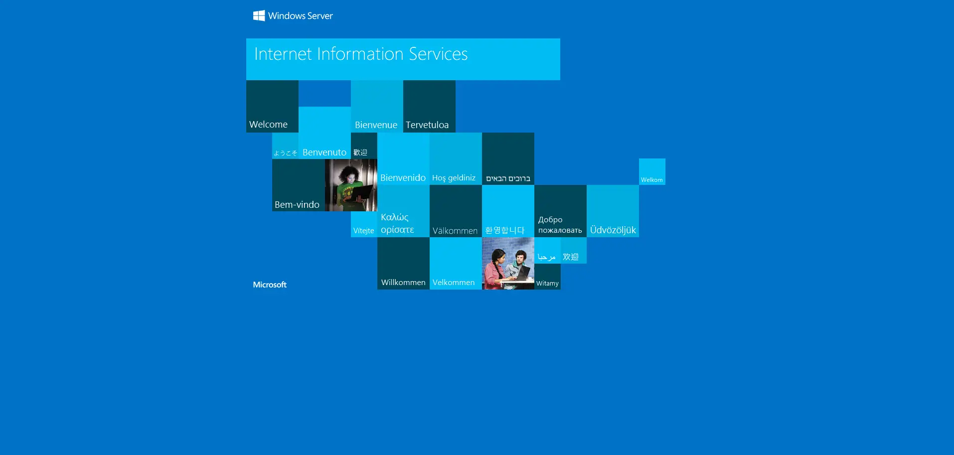
I did a quick Google search and found out that the correct URL is taplink.at. Although it's really not a big deal, I just find it a bit annoying that some brands use these kinds of domain extensions. A ".com" would have made it easier.
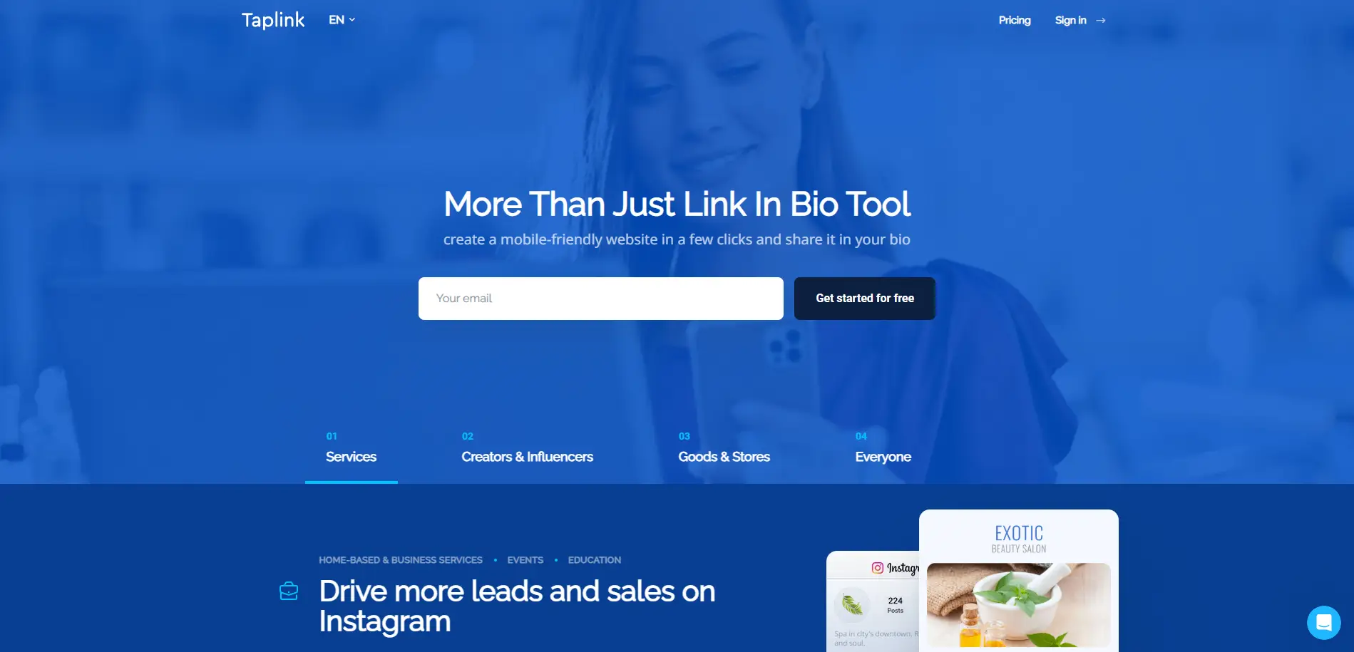
After accessing the right website, I started to register by providing my email address and clicking on the "Get started for free" button. At this point, I was already anticipating that the next page would have instructions to click on an email verification link or enter a code that they would send to my inbox, but to my surprise, it just took me to another sign-up page where I needed to enter my email again or sign up using my Google, Apple, or Facebook accounts.
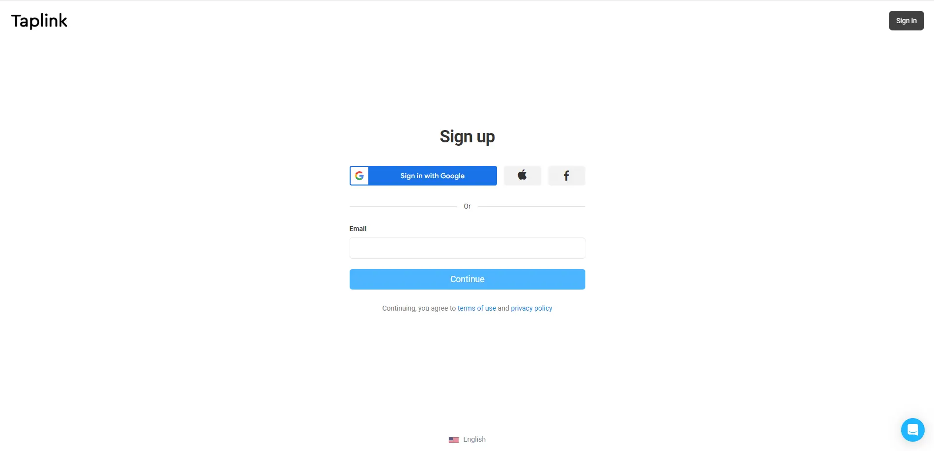
This seems redundant to me. They could have just added a sign-up button on the homepage instead of requiring me to enter my email. It doesn't make sense that they'll ask for it again on the next page. At this point I'm getting little frustrated with the sign-up process. Good thing, this was the only hiccup I encountered during thie registration.
Templates galore!
Now, this is where things get interesting. Under the "Choose Template" section, there's a catalog of layouts grouped into two categories:
- Bio Link
- Lite Website
Obviously, I chose the former since my goal here is to set up my link in bio page. After doing this, I was presented with an array of designs featuring the following motifs:
- Abstract
- Blur
- Business
- Christmas
- Flora
- Flora vector
- Macro
- Materials
- Photo
- Seasons
- Services
- Valentine's Day
- Vector
- Waves
- Weekend
Since I hadn't decided yet, I tried to scroll down to look at the other designs. I was actually surprised to find that there were plenty of options. You see, every time I scrolled down, the page could only display 8 designs, so I kept scrolling and scrolling, which I think took more than 2 minutes for me to reach the end of the page! That's quite a lot, and when I counted, there were a total of 207 template designs.
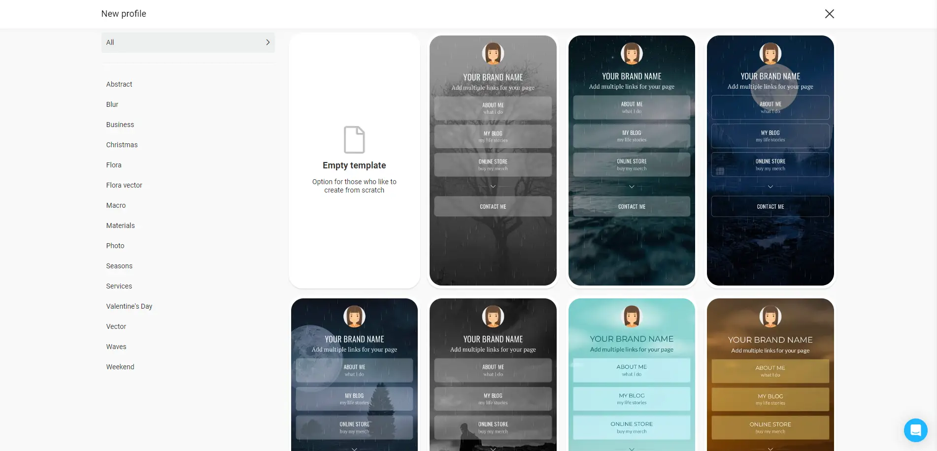
Given that I am only using a free account, I was pretty impressed with the variety of layouts available. They have designs made for different kinds of seasons and events, including Christmas and Valentine's Day. And if none of these choices suit your taste, you can just start with an empty template and create your own from scratch.
Modifying my page
This is the part where I start customizing my page by adding my name, links, and other important details that I'd like to show to my profile visitors.
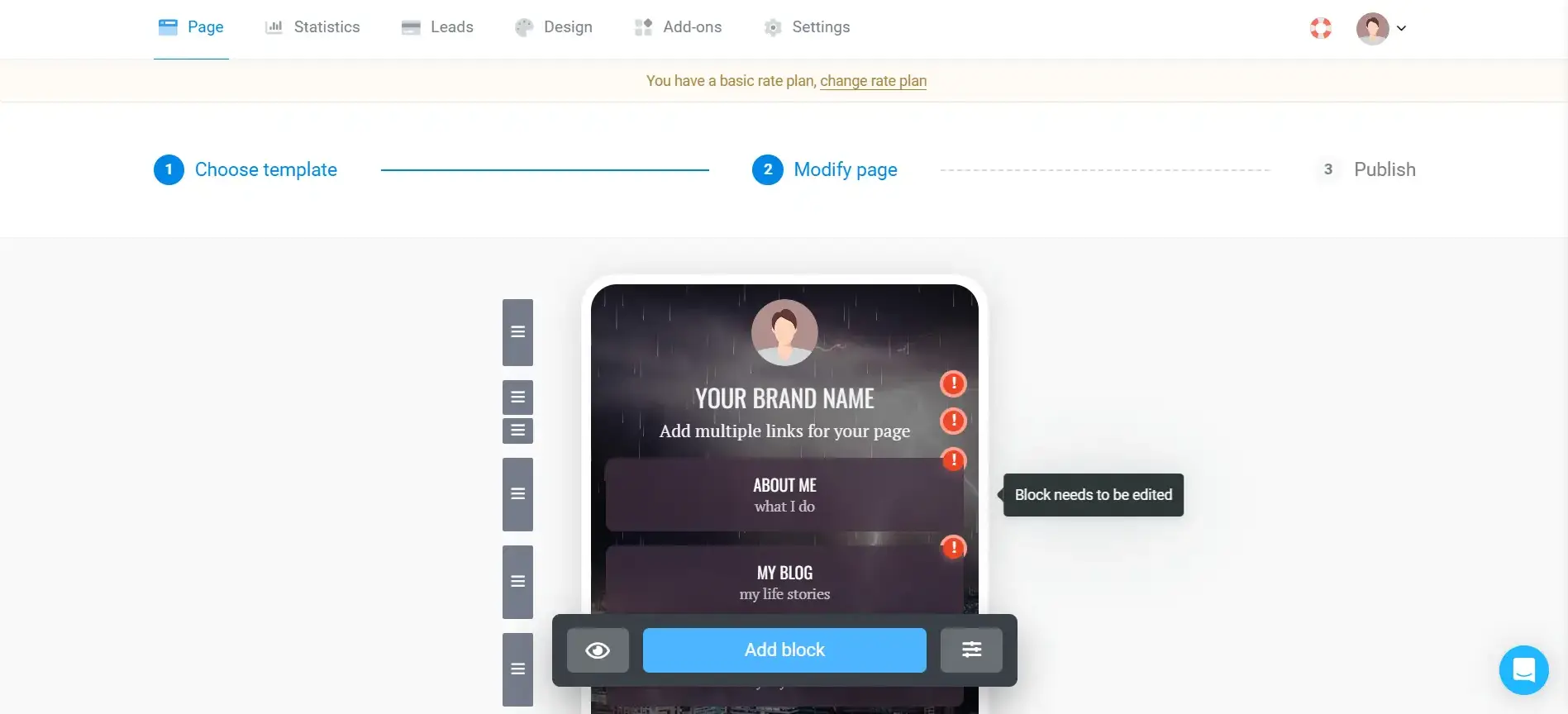
I started by adding my own profile photo or avatar.
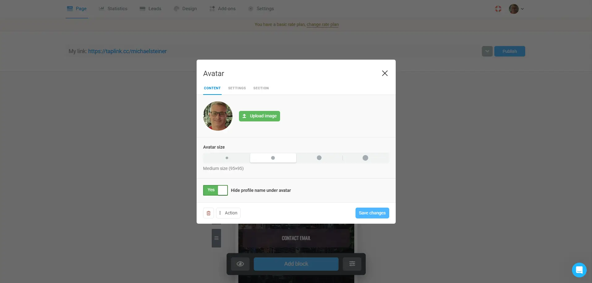
Then I continued by adding my social media links and contact information. I was surprised by the level of customization I could apply to my content and links here. I have the option to add any link or links to an internal page.
Additionally, I can configure the specific actions that can be performed with each link. I can set them for calling, sending an SMS, sending an email, or saving a contact. This was a fascinating way to configure my details.
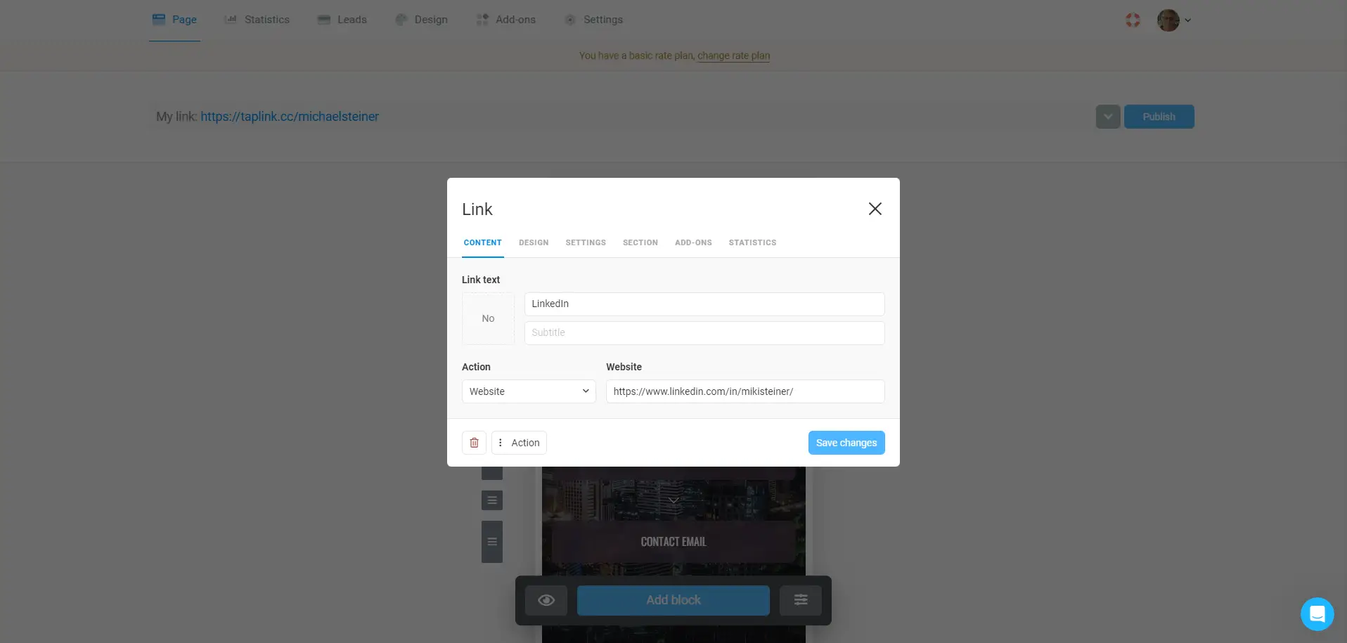
That's it, my Taplink bio page is done!
The entire process of setting up my profile and customizing the design and content took just around 5 minutes to accomplish. This was faster compared to my experience with Linktree, which took a little longer since I had more customization options with that platform.
Take a look at this screenshot taken from my desktop's web browser:

Another thing I liked about Taplink is that all of their pages look good and load well on mobile. With more than half of social media browsing happening on smartphones, it's a logical choice to make everything look pretty on mobile.
Check out this screenshot that I took using my Samsung Galaxy S21 5G mobile phone:
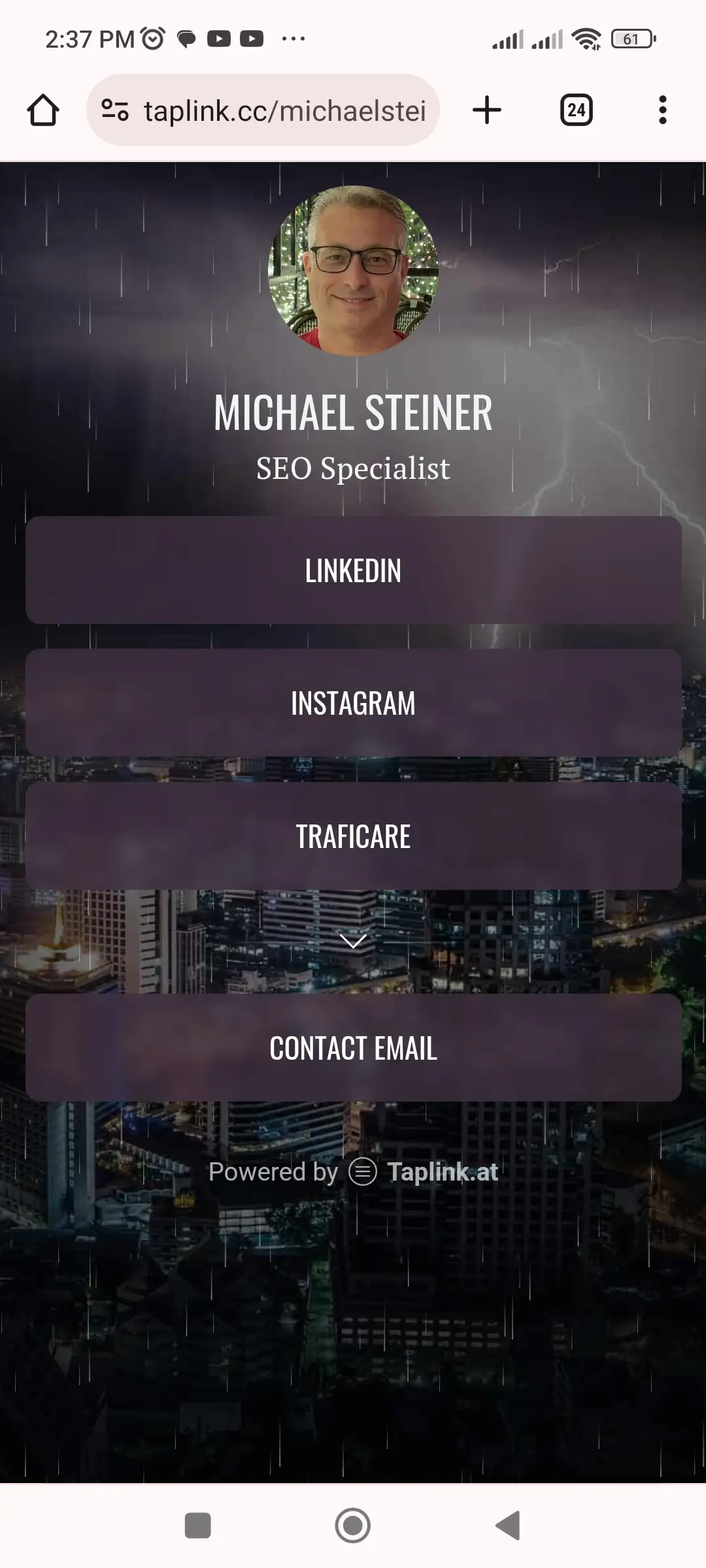
As you can see, the page loaded very well on my device, and the animations too! If you'd like to see my profile and see it in action, simply visit my page at taplink.cc/michaelsteiner
And one more thing: have you noticed that my profile's domain extension is ".cc" and not ".at"? This is another minor concern for me because they decided to use a weird extension again. "CC" sounds like a country code or something related to China to me.
While I appreciate these animations and cool designs, I believe they will not be appreciated by users who plan to use their link-in-bio for their businesses or those building a professional profile or portfolio. You see, I haven't found any design that matches these needs, so the ones offered by Taplink are more suitable for personal bio link pages, including those of content creators or influencers.
Tutorials and FAQ page were good enough
While I find the platform very easy to use, there might still be a short learning curve, especially for newbies. This is where the Taplink tutorials will come in handy. Given that I'm already internet-savvy, I got interested in learning more about the platform's features and other things that I wasn't aware of.
For example, I wasn't aware that they have a QR code feature, so I decided to read the tutorial, which helped me in generating my own QR code.
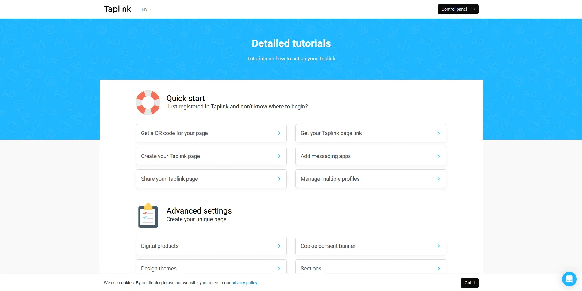
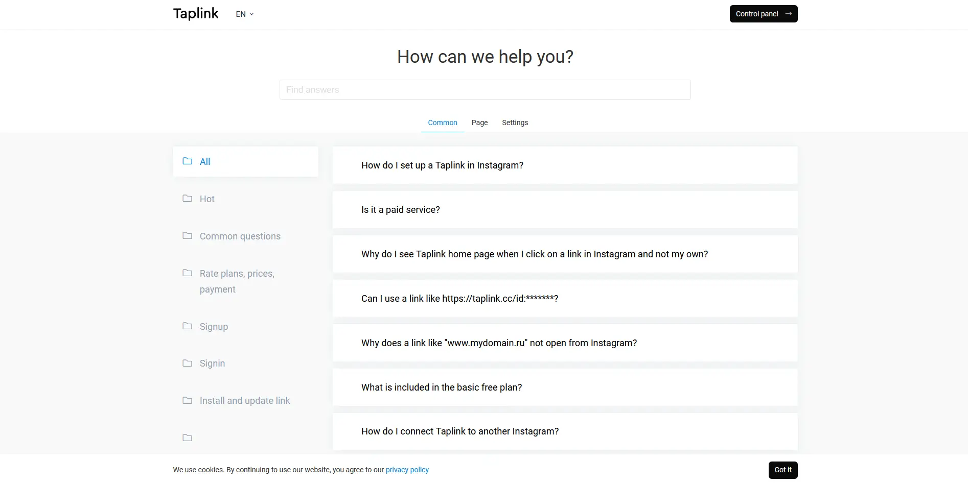
Aside from that, there's a detailed Taplink FAQ page that answers most of the common questions. I suggest checking this section first rather than messaging their live chat team to save time.
Customer support response takes longer than an hour
Since I'm just using a free plan and haven't encountered any issues or concerns with this platform, there wasn't any serious matter to discuss with their customer support. Nevertheless, I decided to check how they handle user queries via their live chat, so I clicked on the chat icon located at the lower right-hand corner of the dashboard.
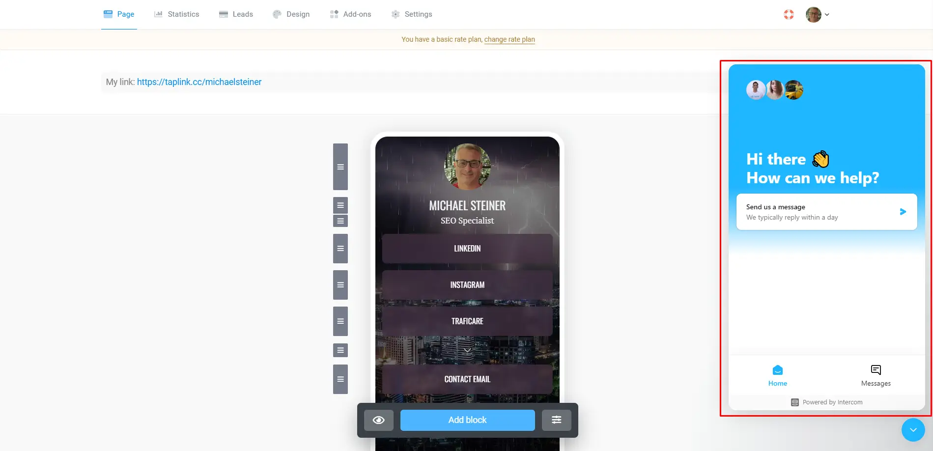
I sent a basic question, but it seems their live chat wasn't available at that time, so I was informed that I would receive a reply through this window and a copy of it via email. True enough, I got an answer from them the next day.
Free plan is good enough for basic users
My primary goal with Taplink's bio link page is essentially to have a page where I can gather all my social profiles and relevant links together, and for this reason, their Basic plan would suffice. In fact, to me, it's more than enough.
However, there's a catch: my profile will have a tiny Taplink logo at the bottom. I really don't mind it since it's too small to be noticeable and it doesn't affect the design of my page. If this minimal branding doesn't concern you, then I suggest settling for this plan.
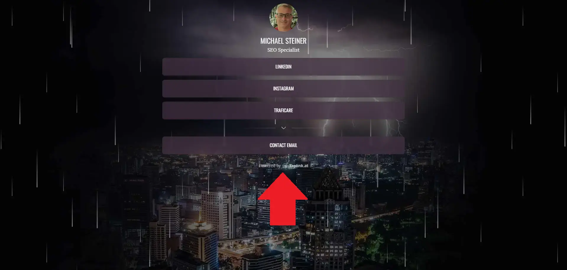
But if you are, let's say, a content creator, an influencer, or running a business/brand, then you will probably need more than just basic features and most likely wouldn't want the Taplink logo to appear on your profile.
In this case, it would be better to check out their premium plans, which have locked-in periods of 3 months, 6 months, and 12 months. Similar to other pricing models, choosing the longer lock-in period will save you more, so you might want to take this into consideration.
| Taplink Plan | Cost (3 Months) |
Cost (6 Months) | Cost (12 Months) |
| Basic | Free | Free | Free |
| Pro | $6 per month | $4,20 per month | $3 per month |
| Business | $12 per month | $8.40 per month | $6 per month |
The Pro plan is ideal for content creators and costs around $3-6 per month. On the other hand, the Business plan is more suitable for entrepreneurs. So, if you're looking to sell products or services, or monetize your content online, then this is the recommended plan for you.
Taplink's analytics is called "Statistics"
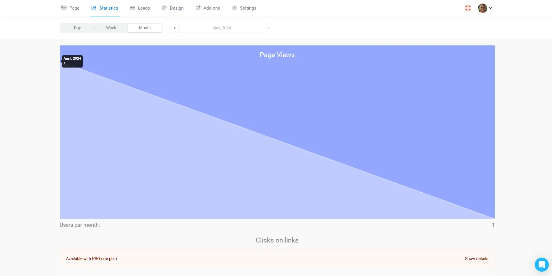
I was curious to know how their analytics (they labelled it as "Statistics") feature works and how much detail I would be able to retrieve, but it turns out that the free plan only allows you to get the number of page views per day, week, or month.
If you're someone who's obsessed with insights and you're just using the basic plan, then you won't have much data to look at. If you want more information, such as link clicks and conversions to better understand your audience, then you'll need to upgrade to either their Pro or Business plans.
Pros & Cons
Pros
- Interface is very user-friendly
- Over 200 bio link template designs
- Some templates come with animations and visual effects
- You can create your own QR code
- Pages load well even on mobile devices
Cons
- Website uses a .at domain extension which is quite uncommon
- Profile link uses a .cc extension which sounds weird
- Basic plan doesn't allow use of icons for links
- Template designs are not suitable for businesses or professionals
My Verdict
I've had a fair share of good and bad experiences with Taplink. On the plus side, the customization options, user-friendly interface, and plethora of template designs with animations are definitely noteworthy. However, on the other hand, the unusual ".cc" domain extension and the lack of customizable icons for the free plan are some of the downsides I've found that you should also be aware of.
Overall, it's a good platform for building a link in bio, but if you want better customization and a less unusual domain extension, then it might be better to consider other well-known brands like Hopp or Linktree.


