Setting up an about.me link in bio page can be time-consuming. However, while the final result looks great, be prepared for significant about.me branding if you opt for the free version.
Key takeaways:
- Opening an account involves several steps.
- There is a free version available, as well as a paid plan that costs $8 a month.
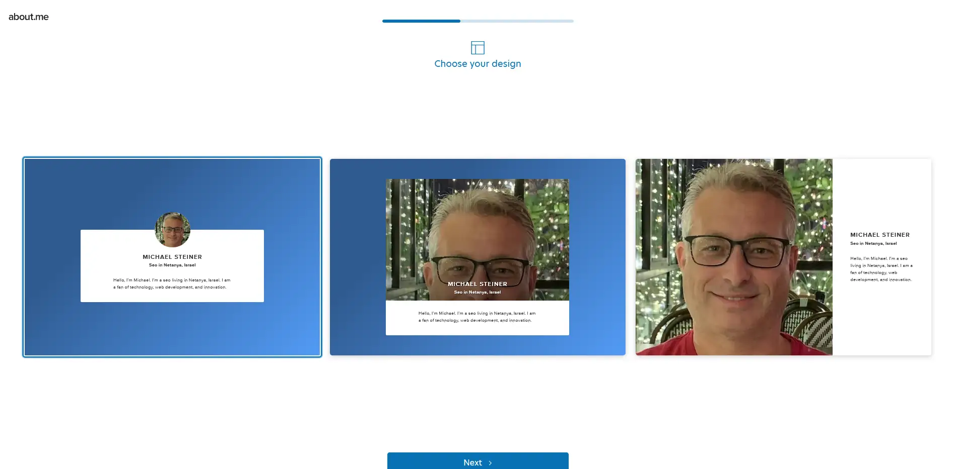
- It offers only three designs, but each has a distinct structure/layout.
- An AI tool is available to help generate a quick bio.
- The call-to-action button can be customized in various ways.
about.me caught my attention as a platform that might offer something beyond the typical link-in-bio service. In fact, it is often mentioned in lists of recommended platforms for creating bio links, so I finally decided to check it out and see if it might work for me.
This review that I wrote explores its features and compares them with the other brands that I've previously tested. Follow along as I break down my personal experience with this platforrm. I'll highlight what sets it apart and where it might fall short.
The about.me website lacks personality
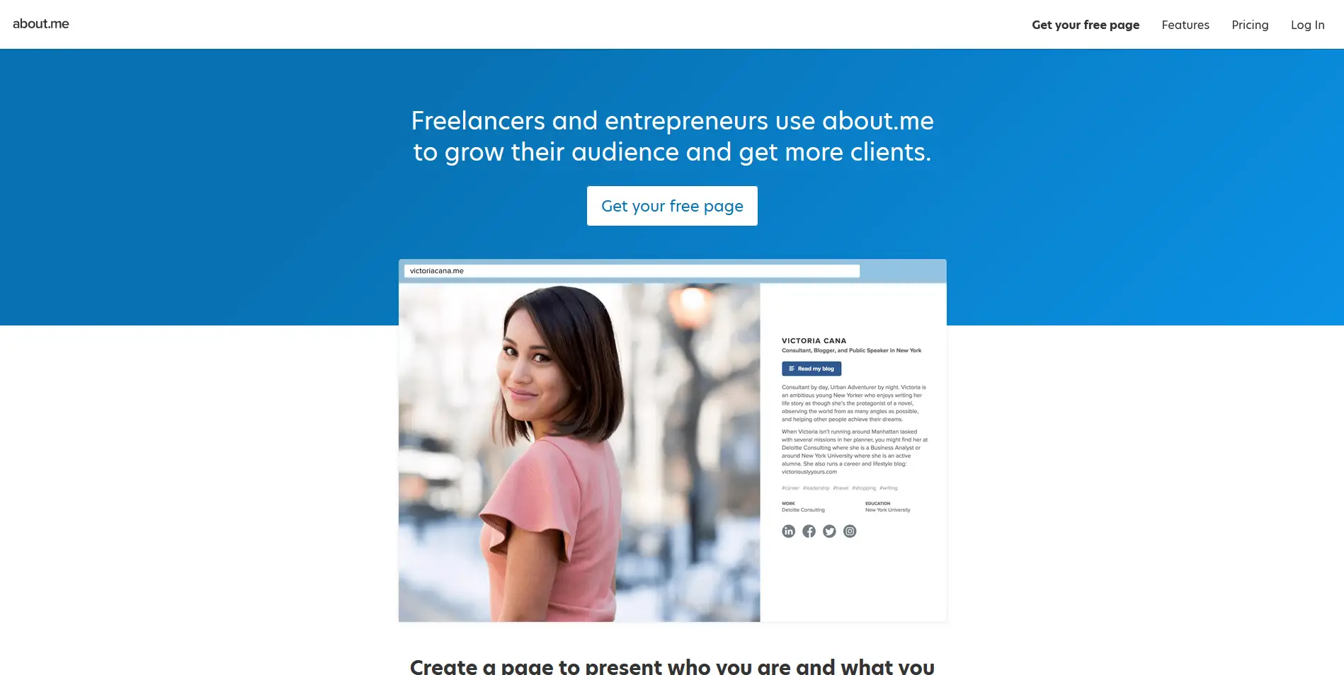
My journey started by accessing the about.me website which is literally about.me. Having read so much about this platform, I was expecting their website to be fun or inviting. However, it turned out to be a disappointment because I landed on a homepage that looks plain and lacks personality. I mean, come on, this is their homepage—it should at least be welcoming, right?
The lengthy registration process begins
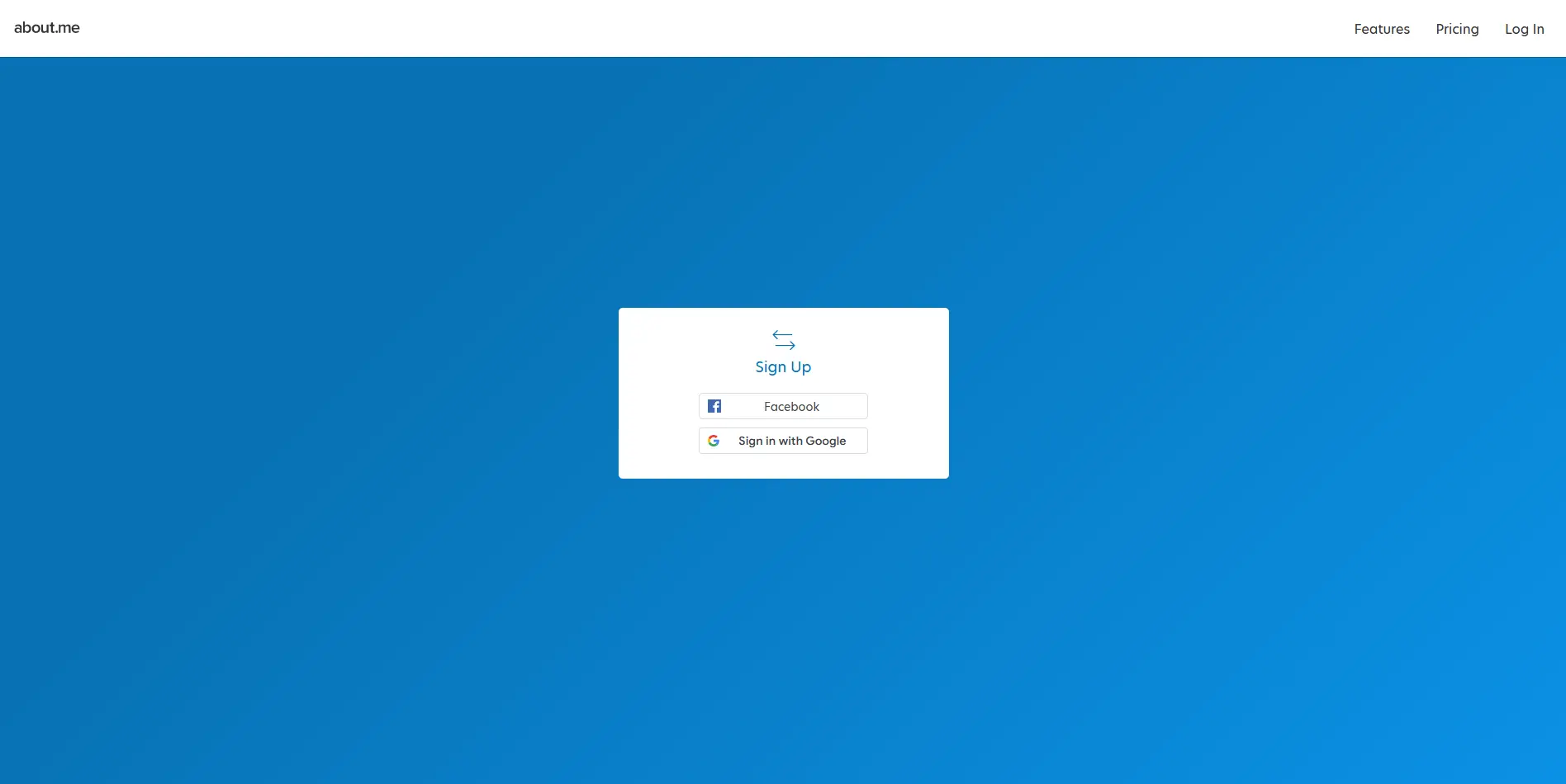
Clicking the "Get your free page" button on the homepage took me to about.me's registration page. While I appreciate the support for signing up via Facebook or Google, I was surprised to find that they no longer offer the option to register using an email and password. This is something you might want to consider if you prefer not to connect a third-party account with this platform.
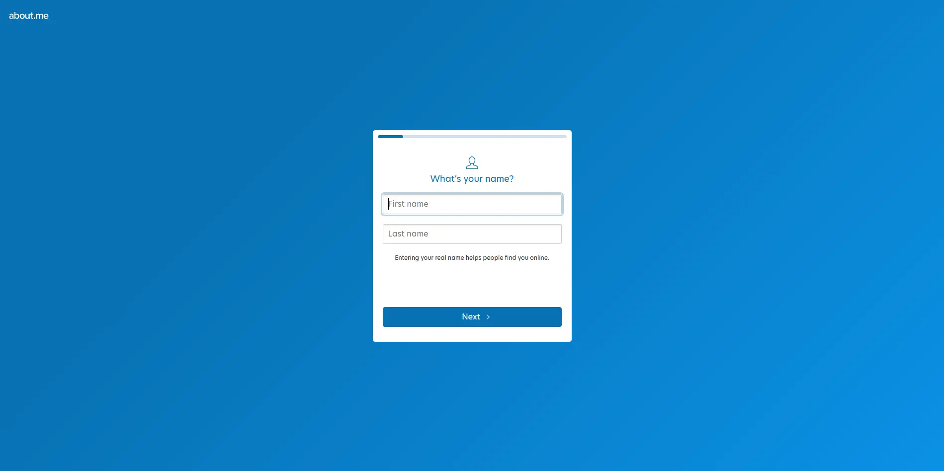
The next step of the registration process is simply providing my first and last name. This one is pretty straightforward and requires no further explanation.
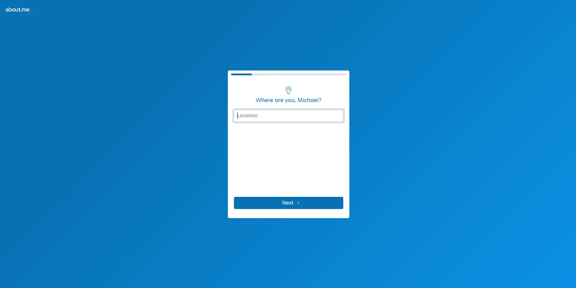
After that, it asked for my location. Here, I can enter any place because it's a freehand field. It can be a full address, a city, a state, or even a different planet like Mars—or an imaginary one.
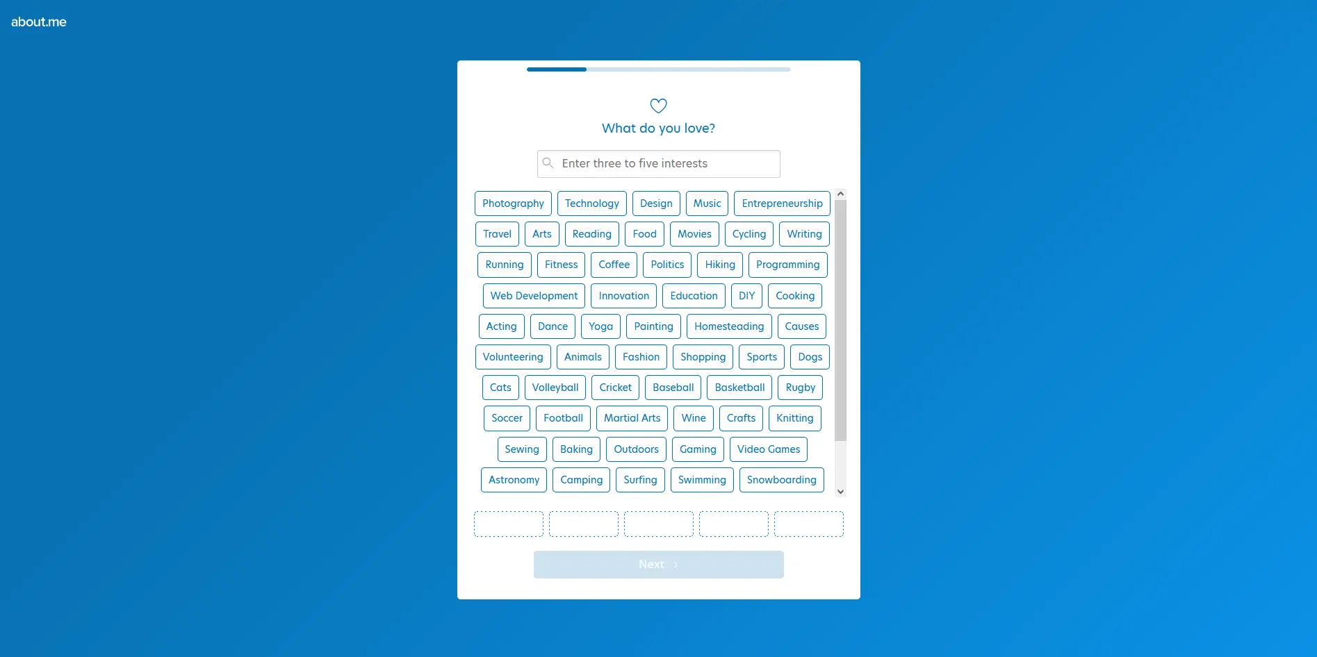
At this point, I thought the registration process was already done, but it didn't seem so. It kept asking for many details, including the things I love. I had to choose at least three interests in order to proceed to the next step.
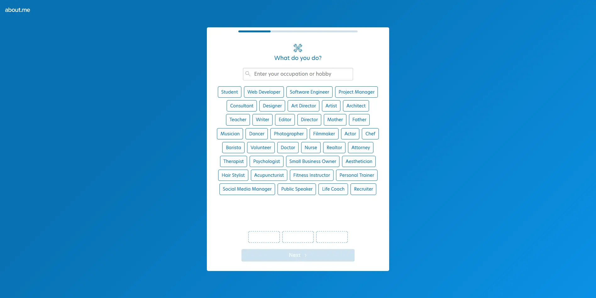
And so, the question and answer portion continues. This time, it asked for my occupation or hobby. When will this ever end?
Finally, the light at the end of the tunnel
It now asked me to upload my desired profile photo. At this point, I assumed that the registration process was complete, as it no longer required any onboarding-related tasks.
Only 3 designs to choose from
Now we're past the boring parts. Here, I was asked to choose from the three available designs. I was expecting more options, but this was actually way better than Campsite. That platform has more themes, but all of them have the same layout. This is where about.me has the advantage. They may only offer three designs, but there's a significant difference with each one.
When it comes to digital marketing, the more unique you are, the more likely you'll be able to capture the attention of your target audience. For this review, I chose the first option.
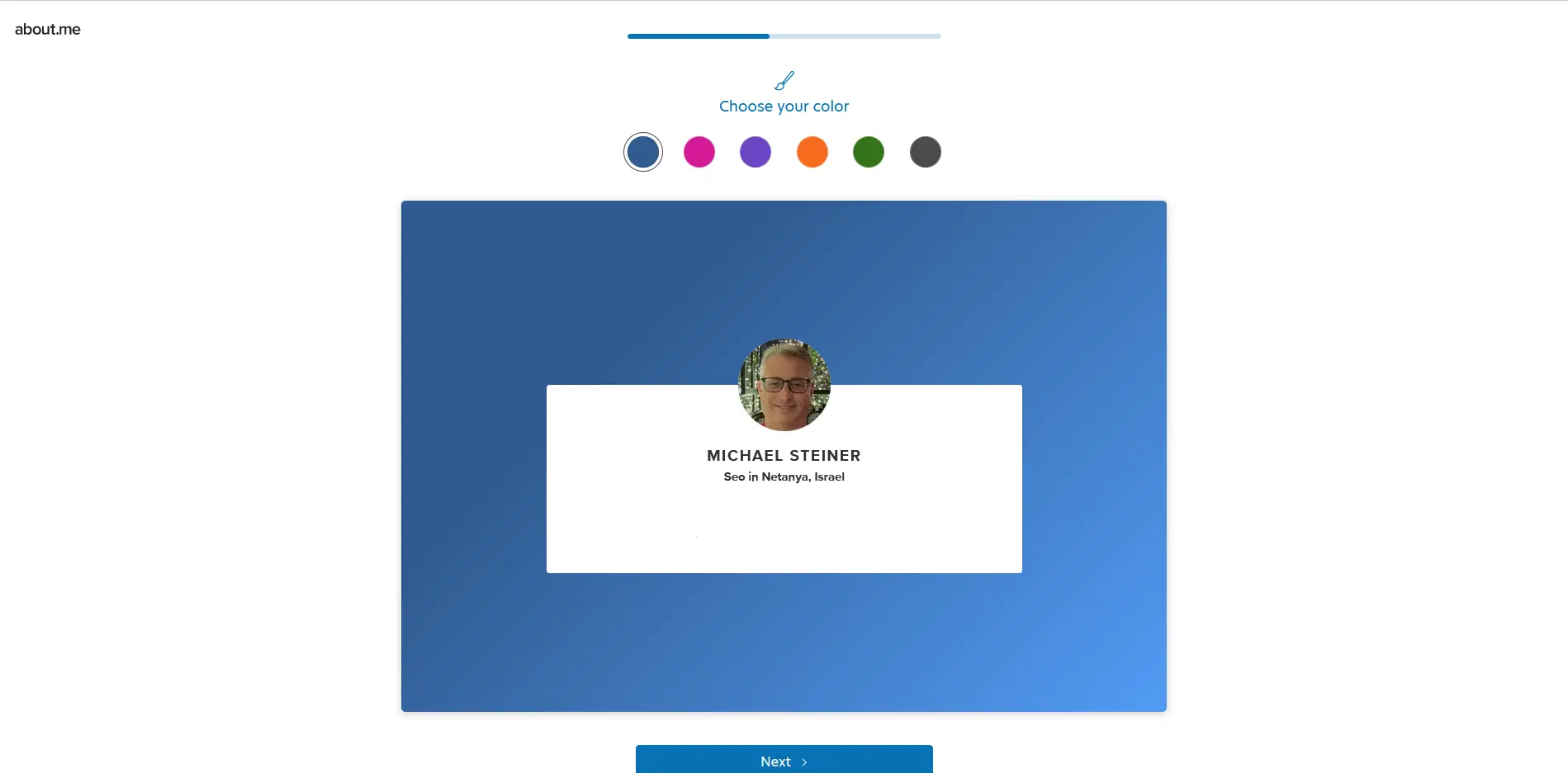
After choosing my preferred design, I was then asked to select my favorite color. It's nice to know that I can configure this part to match it with my personality or branding.
Connecting a domain
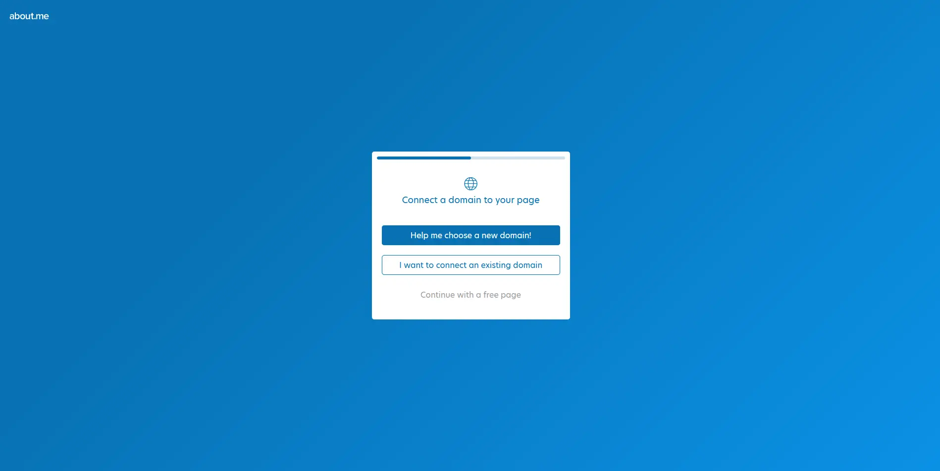
Right after saving my chosen color, about.me then asked me to connect a domain to my page. At first, I wasn't really sure what to do with this. Then I realized that this feature is basically them enticing me to get a personalized domain, which would require me to upgrade to a paid account.
Nice try, but I still prefer to use the free plan for now, so I just clicked on the "Continue with a free page" to skip this option.
Wait, there's no username yet?
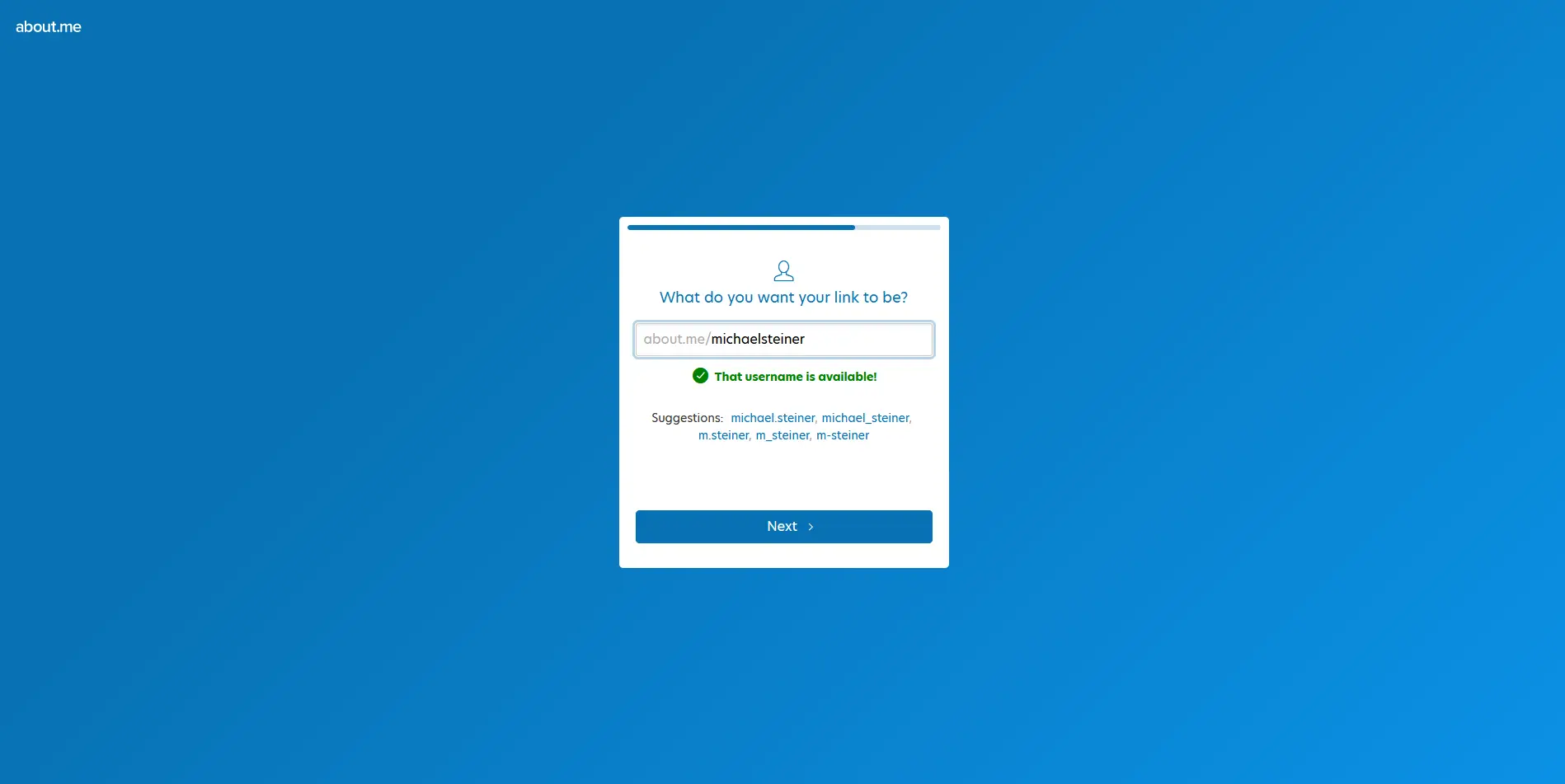
The lengthy registration process really kept me so occupied that I don't even remember them asking for a username yet. It's kind of weird, though, that they placed this step just after the extensive onboarding and profile customization. I mean, what if my preferred username wasn't available and I'm no longer interested in continuing to set up my profile? It would have been a waste of my time.
No time to write a bio? about.me's AI do can do the job
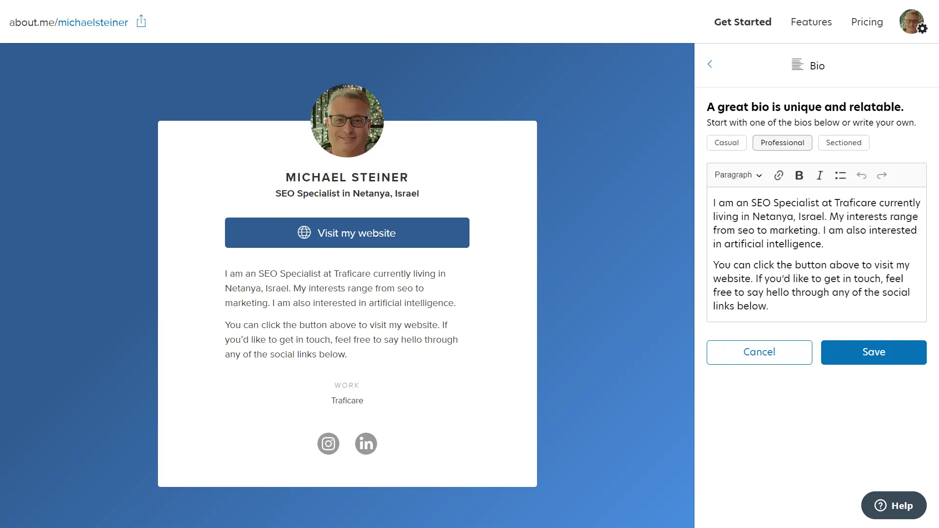
Remember all that information that about.me asked me to provide? Well, it turns out that I can use it to generate my bio. I just need to choose from the three presentations (casual, professional, sectioned) to create one using AI or simply write one on my own. It's a cool feature, especially for those who are too lazy to write or those who don't have the time to compose a creative bio.
Setting my bio link's goal with the Spotlight button
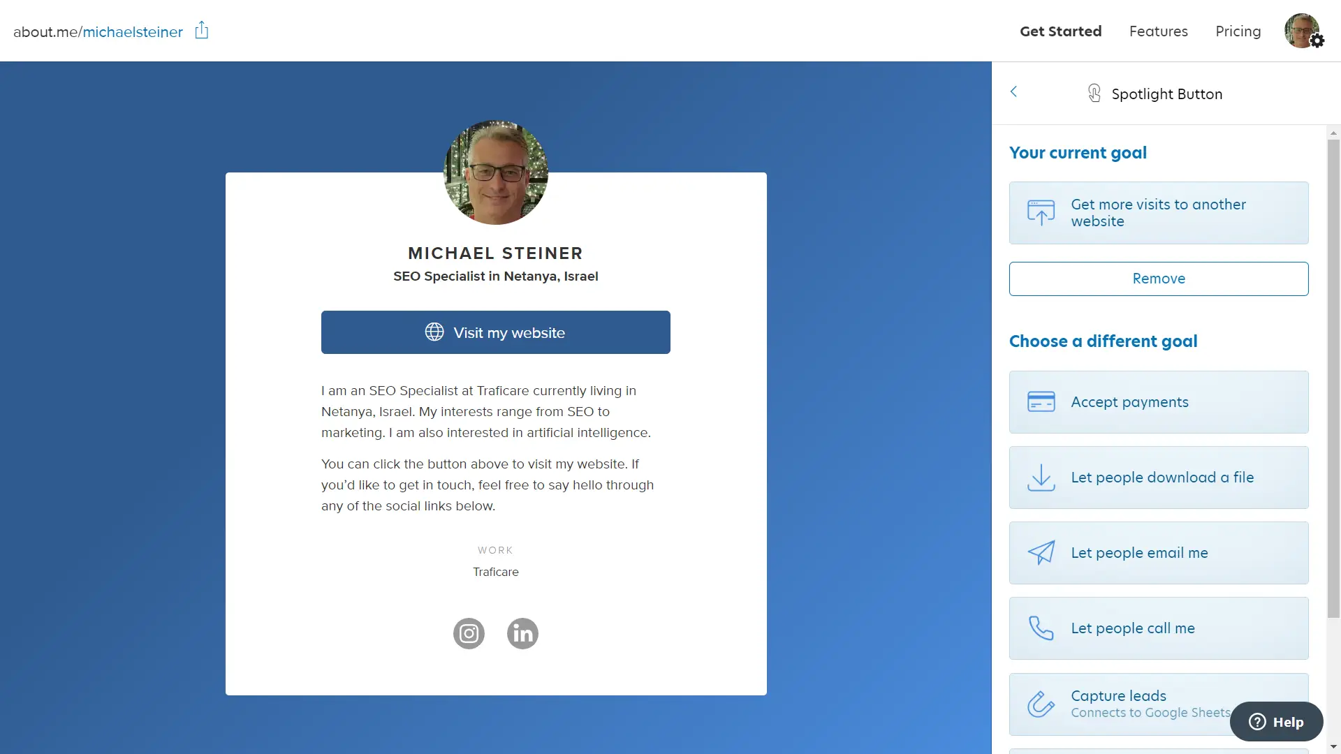
The Spotlight button is one of their features that I find unique. Configuring this section required me to set the goal of my page, and these were my options:
- Get more visits to another website: Here, I need to provide a link to the website.
- Accept payments: The button can be used to send me payments or redirect to my payment page (only available to Pro accounts).
- Let people download a file: They can download my paper, read my resume, or access any file I offer (also a Pro feature).
- Let people email me: Here, they can ask me about something, book a consultation, contact me, hire me, or send a message (another Pro feature).
- Let people call me: I just need to enter my phone number here.
- Capture leads: This option connects to a Google Sheets account (requires a Pro account).
- Let people book time with me: This saves the bookings on my Google Calendar (also needs a Pro account).
It's actually quite similar to the call-to-action (CTA) buttons offered by other platforms, but what I liked about this one is that they added a twist to it. It actually got me hooked on setting my goal and choosing which specific button to use.
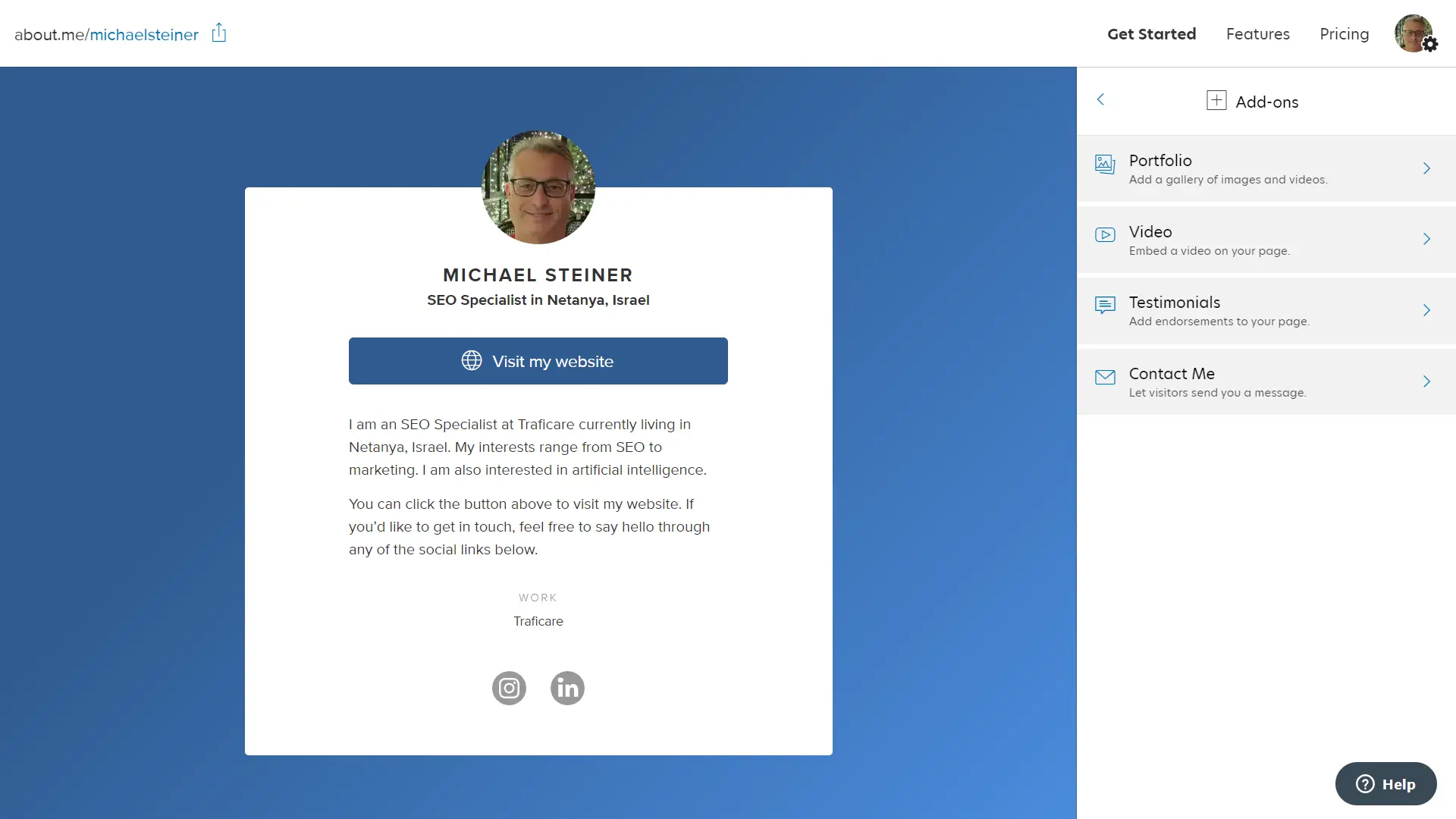
Add-ons were interesting but only available to Pro users
The platform also has some interesting add-ons, but the downside is that these features are not available for the Free plan. This includes the following:
- Portfolio: Here, I can present up to 30 images and videos.
- Video: The platform supports embedding videos from YouTube, Vimeo, or Facebook.
- Testimonials: This is a good way to showcase any endorsements or recommendations to demonstrate my credibility.
- Contact Me: This serves as another form of CTA for my visitors to send me a message.
Highlighting what's important on my photo
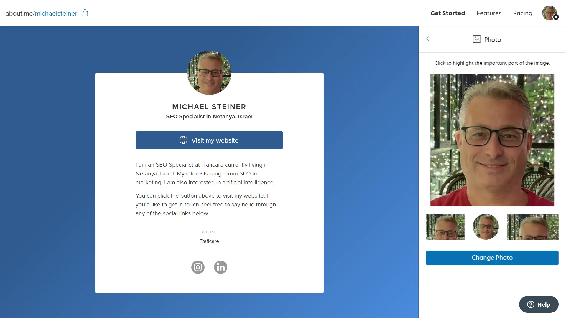
This is another cool feature worth mentioning. What is basically does is that it allows me to select the most important part of my photo. Let's say I uploaded a photo of myself, but there are other distracting elements in the image. This feature lets me select the part that I want to highlight on my profile. So, even if my face is, say, in the corner of the photo, I can still highlight it. It's somewhat like a crop feature but more engaging version.
Social links
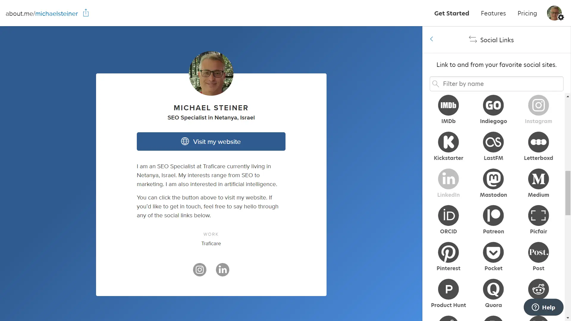
The social links section, as you've probably guessed, is for adding all my social network profiles. It was good to know that they support a wide range of platforms. In fact, the list was so long that I had to use the search bar to find LinkedIn and Instagram, which are the two profiles I have.
The great thing about the social networks they support is that it assigns a relevant icon to each profile. So, if I have an Instagram link, it will naturally display the Instagram icon for it.
See for yourself: my live about.me link in bio
Finally, after a lengthy process, my about.me link in bio page was finally published. It looks just like it did in the preview, but I was somewhat disappointed with the excessive about.me branding on my profile. Take a look and see what I mean:
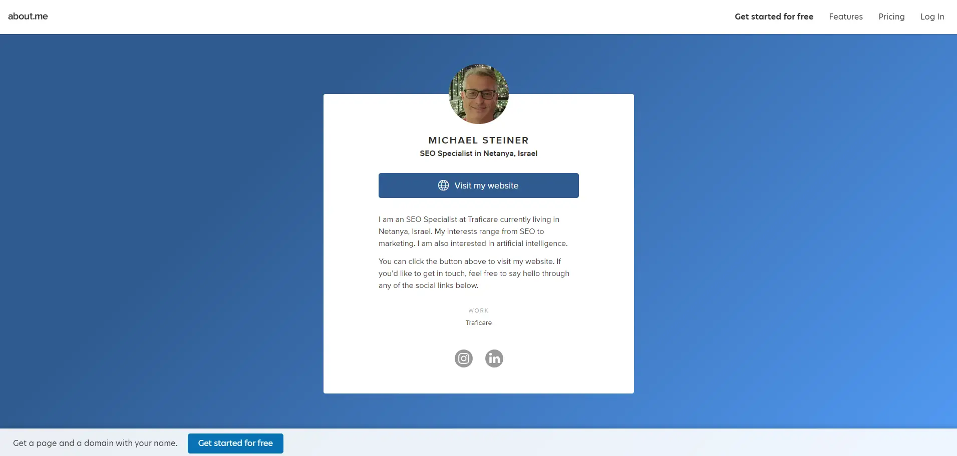
As you can see from the screenshot I took, there's an about.me menu at the top with links to features, pricing, and login, and then there's another more prominent CTA at the bottom. Feel free to access my profile here: about.me/michaelsteiner
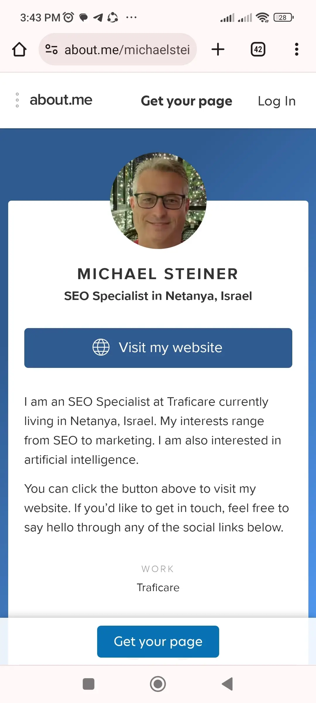
On mobile, it looks even more intrusive. I think they could have settled for just one CTA. I understand that I'm using a free account, but there's just too much advertising on my profile. In comparison, Hopp also offers a free account, but their branding, even for profiles of non-paying users, is much less distracting. You can check out my Hopp link in bio here: hopp.bio/michael-steiner
Plan: it's either the Free or the Pro
While I appreciate that about.me offers a free plan, I find the features too limited, with the exception of their designs and Spotlight button. This has me wondering if the Pro account is a good option. This paid plan costs $8 a month or $79 a year.
| about.me Plan | Cost (Monthly) | Cost (Yearly) |
| Free | Free | Free |
| Pro | $8 | $79 |
For someone like me who only plans to use this link in bio to aggregate my sites and social links, it's an additional expense that's not worth considering. However, if you're an influencer, content creator, or running a business, then you should weigh the cost. What I would like to highlight here, though, is that their paid plan is still much cheaper than the premium plans of Linktree ($48-$234) and Carrd ($9-$469).
Chatbot was not as smart as I thought
When all is said and done, customer support is a major factor in any decision-making process (at least it should be). With about.me, however, accessing the support menu was relatively easy. I just needed to click the "(?) Help" button in the lower corner of the screen. This launches their AI chatbot, which I expected to be smart enough to answer basic questions. I was actually curious to know if they had more than just three designs, but the AI wasn't as smart as I thought; it only gave me a link to an article titled "I don't see a feature I need," which was not relevant to my query.
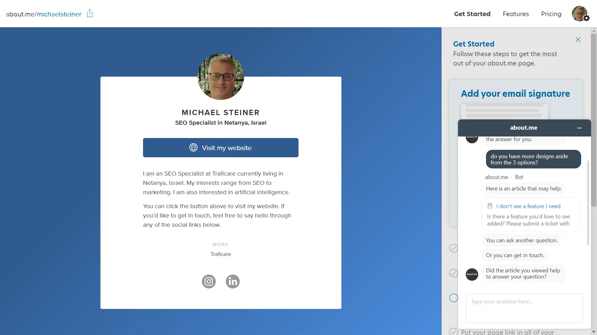
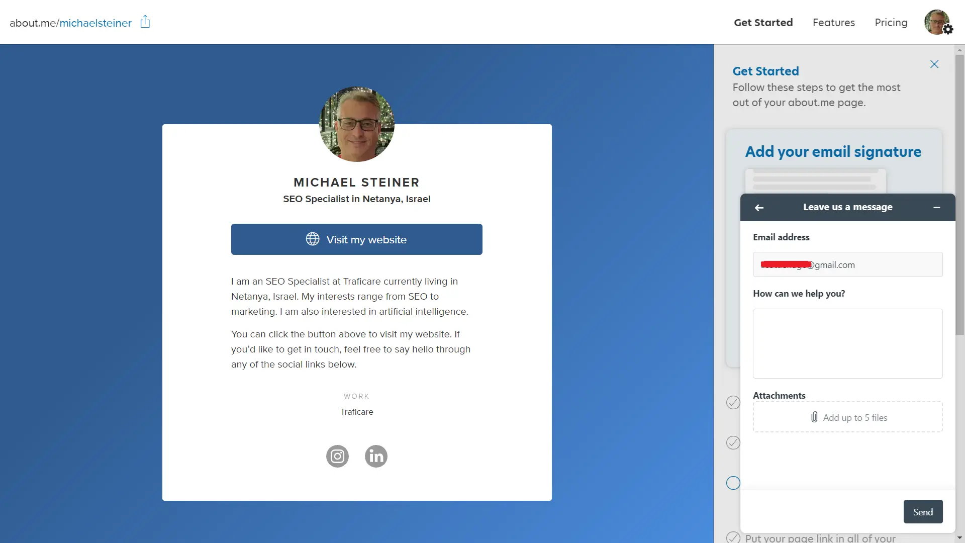
After this, I was asked by the bot if the information provided had answered my question. Obviously, it hadn't, so I decided to get in touch with a real agent. At this point, I was expecting to start a live chat session with one of their agents, only to be asked to just leave a message. I left them a message and received an answer by the next day.
Pros & Cons
Pros
- Each design has a totally different layout
- AI tool to generate a custom bio
- Spotlight button can be used for customizing CTA
- Supports various social links
- Paid plan is cheaper than other platforms
Cons
- Lengthy registration process
- Only has 3 designs
- Too much branding on the free profile
- Support chatbot was not smart enough
My Verdict
My experience with about.me was a mixed bag. On the bright side, they offer different kinds of layouts, have a useful AI for generating a bio, and a Spotlight button to curate my desired CTA. On the other hand, the registration process was very time-consuming, the designs are limited, and there is too much branding on my profile (I know, I'm just using a free account, but still).
If you need to professionally showcase your link in bio with a good layout—without having to pay a subscription fee—but can live with about.me's extensive branding, then go ahead. However, if you're looking for more customization or functionality, or you prefer a quick bio link page setup, then you might want to check out some alternative platforms instead.


