Shorby lets you set up your link in bio right after you access their website. However, some features become inaccessible after the trial period.
Key takeaways:
- Comes with a 5-day free trial.
- Choose from 30 different color schemes or opt for automatic selection.
- Offers many creative blocks to make the page more engaging.
- Supports only 11 social media platforms.
My deeper exploration of link-in-bio platforms has led me to learn about Shorby. This brand promotes the idea that it can "supercharge" Instagram and YouTube bios through its micro landing page, which, according to them, can drive traffic and conversions. I was intrigued to find out if their statements hold true.
Here, I’ll take you through a hands-on experience using my own Shorby account, examining all of its features, including not just the pros but the cons as well. Let's make a start, shall we?
Step #1: accessing Shorby's website
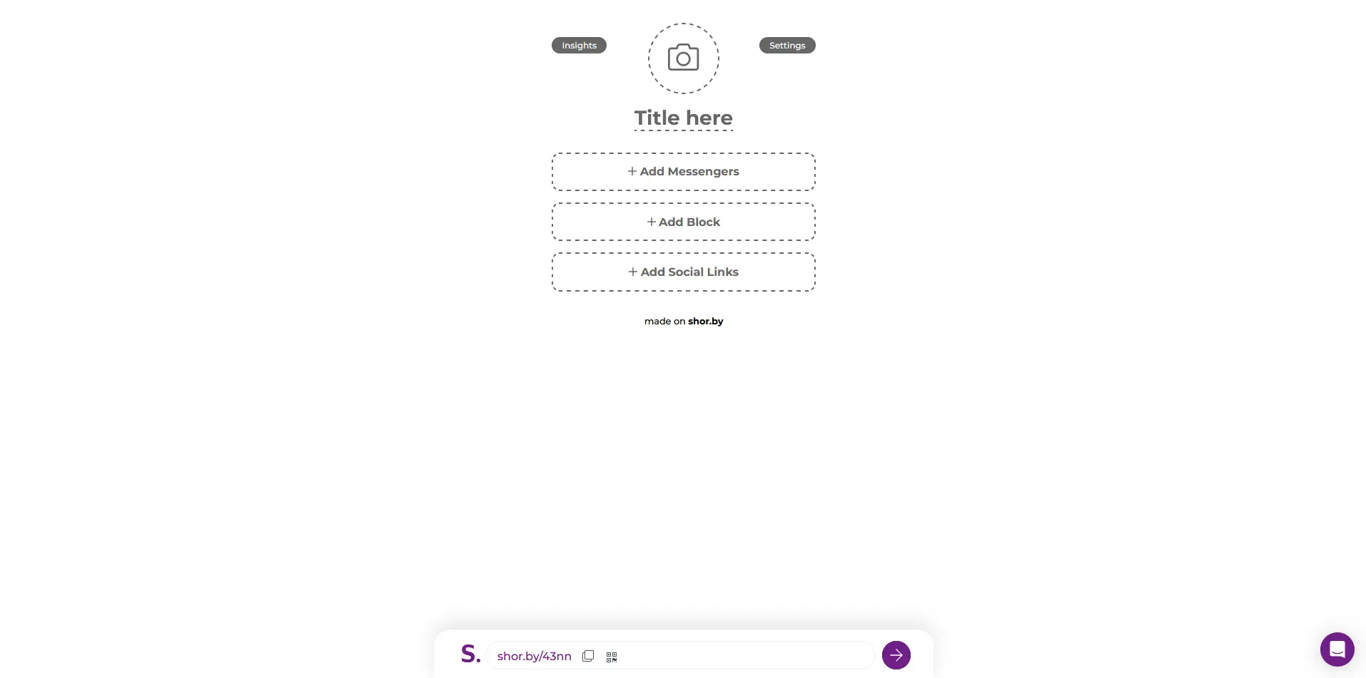
My first step was visiting the Shorby website. I entered shorby.com into my web browser, and it redirected me to dash.shor.by/smartpage. At first, I thought I already had an account with this brand, as I assumed that "dash" in the URL meant "dashboard," but when I tried to access the website again on a different browser, it still took me to the same URL.
It then immediately loaded a link-in-bio editor page where I could start uploading my photo and adding my links. It seems like Shorby's onboarding steps are different. With other platforms, I usually start by opening a website, clicking on a button or link to register, and then I get to a page like this.
Dynamic ways to add a profile photo
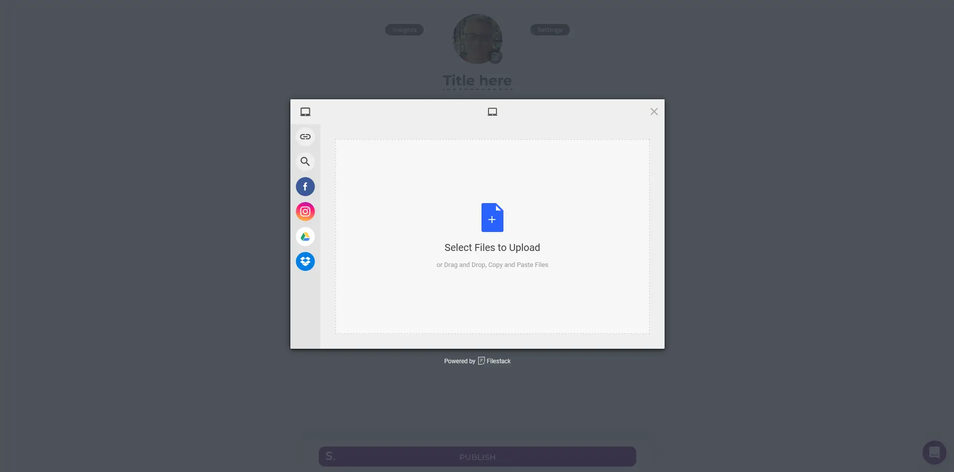
The initial part of the profile customization involved adding my profile photo. This part was also interesting. Rather than just the traditional way of uploading a photo from my device, I was given several other methods to add my picture:
- My Device: This is the common method we all know. I look for the file in my folders and then select it.
- Link (URL): I can also just enter a direct URL of my photo if it is hosted publicly on another site.
- Web Search: It even allowed me to do a web search for my images.
- Facebook: I can use the same profile photo that I have on this social network.
- Instagram: This is another alternative social network where I can fetch and use the same profile photo.
- Google Drive: If it's saved on this cloud-based storage service, then I can also get it from here.
- Dropbox: This is also another popular cloud file storage that it supports.
I remember that my photo was saved in my Dropbox account, so I decided to use this option. This is a pretty cool and dynamic feature that I haven't seen in any other platform.
Messengers: a nice way to display all my communication channels
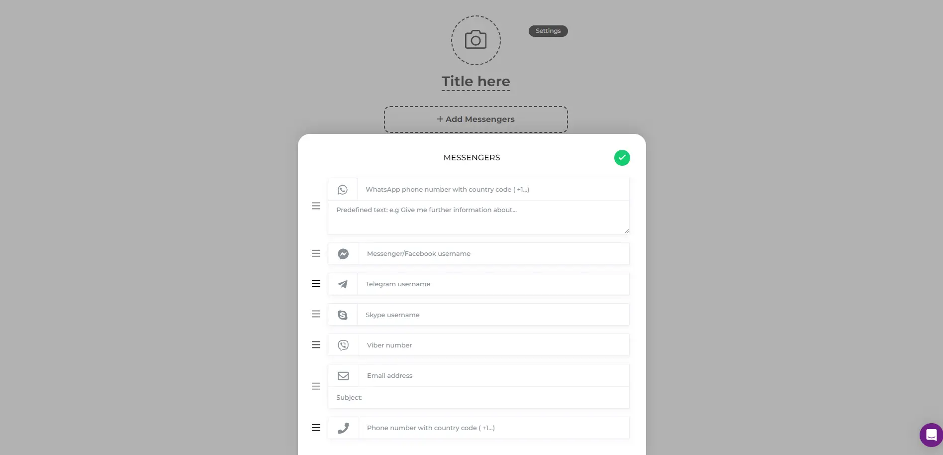
This section is where I can add my contact information, including phone numbers or any other instant messaging apps and platforms that my audience can use to get in touch with me. Below are the contact methods that they support:
| Messaging Platform | Detail Needed |
| Phone number with country code + predefined text | |
| Messenger/Facebook | Username |
| Telegram | Username |
| Skype | Username |
| Viber | Phone number with country code |
| Email address + subject | |
| Phone Number | Phone number with country code |
This is a very nice way to present all my communication channels so that my visitors will have all the information they need whenever they want to contact me.
Blocks: other creative elements worth checking out
This section is for adding other creative visual elements to the profile.
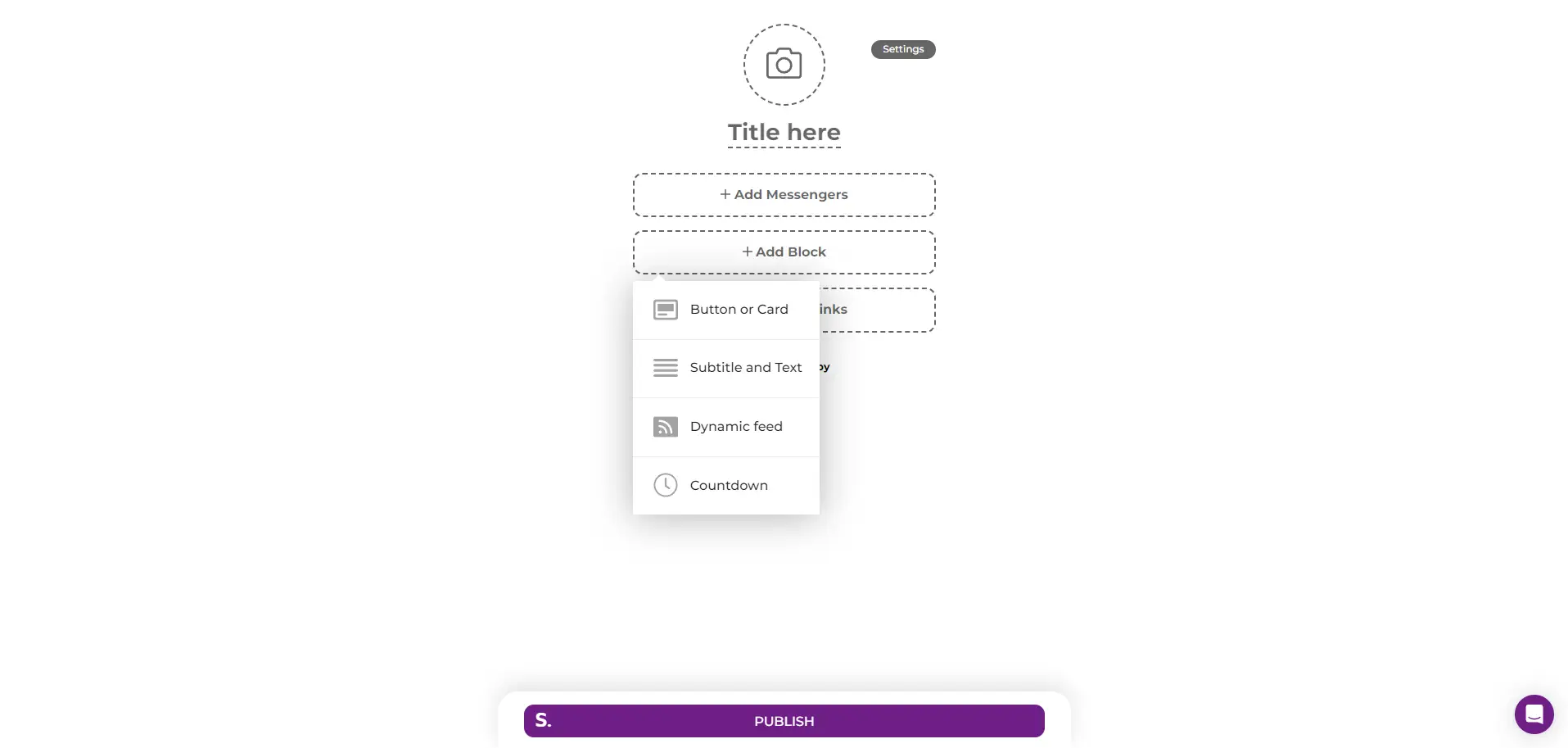
Let me break down each block to discuss what it is and its purpose:
Button or Card
This is where I can add websites or any links that are not from social networks. I just need to add a link, a title, and assign an icon for it (or not) from the 1407 options available. In my case, this was the only relevant block for me, and I used it to add my website.
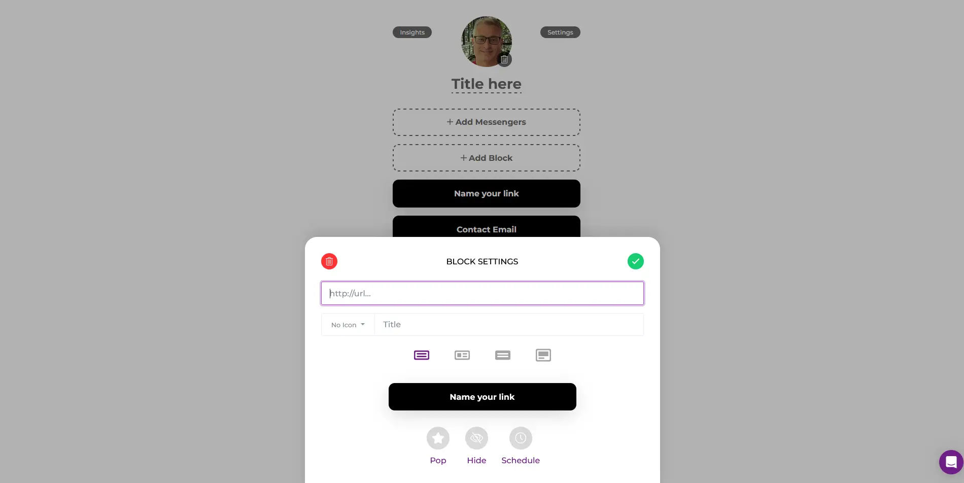
Subtitle and Text
As the name suggests, it's a block that includes a title and text for just about anything. There's even an option to hide it (instead of removing it) or set a schedule for it to appear.
Dynamic Feeds
This can be very useful for those who have blogs with an RSS feature. This block supports feeds from YouTube, WordPress, Apple Podcasts, Shopify, or any website that has an RSS or Atom feed.
Countdown
This is another cool feature. Just as it's named, it's a block that I can configure to show for a specific period. Here, I can upload an image, add a title, text, and the link that I'd like to appear at a designated date and time. It has a start and end setting and can even be configured to follow a chosen timezone.
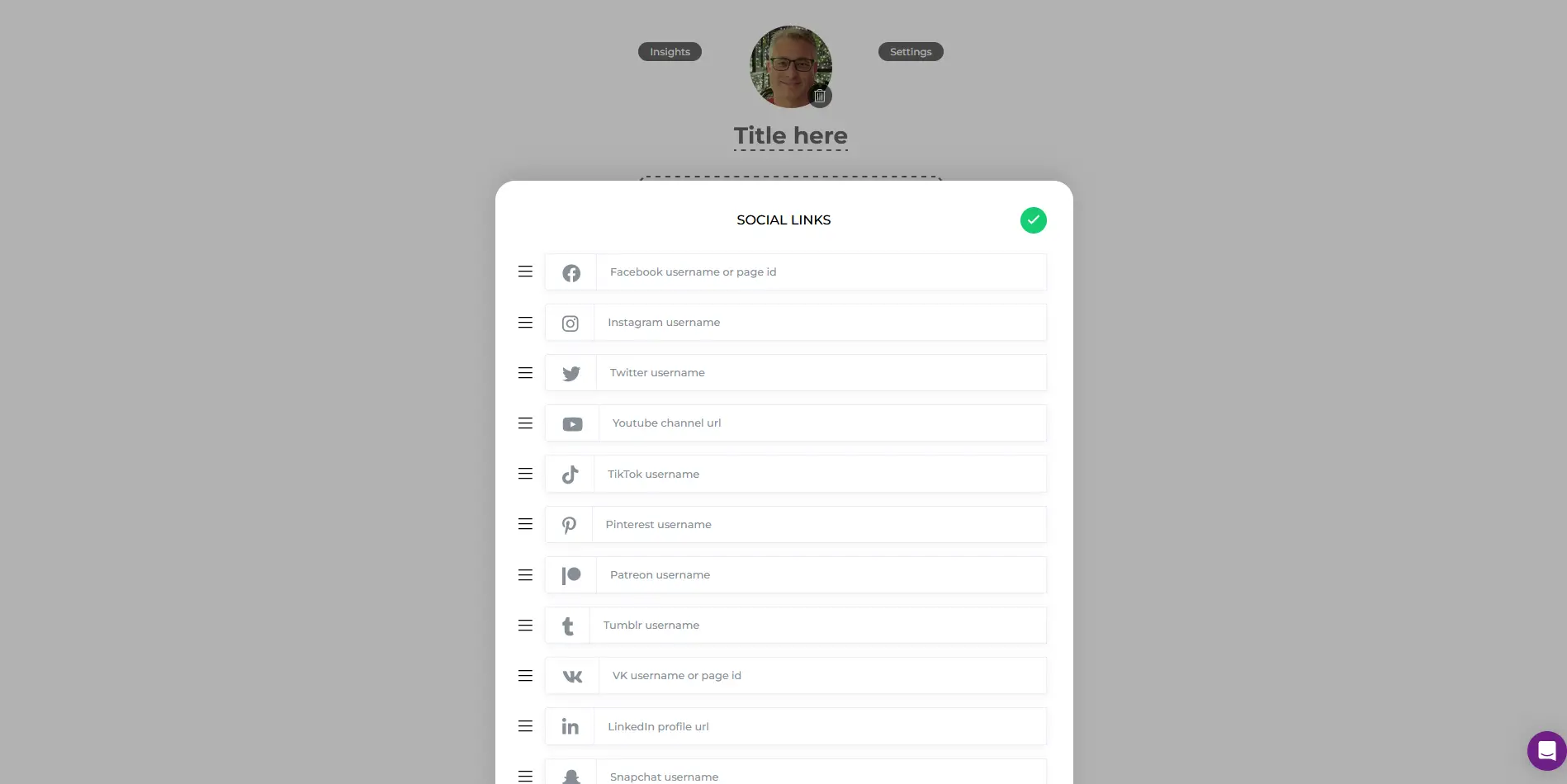
Social Links only supports 11 platforms
This particular section is for, as you most likely have guessed, social network profiles. While it's good to know that they have such a feature, the downside is that the number of platforms they support is limited:
| Social Media Platform | Detail Needed |
| Username or page ID | |
| Username | |
| X (Twitter) | Username |
| YouTube | Channel URL |
| TikTok | Username |
| Username | |
| Patreon | Username |
| Tumblr | Username |
| VK | Username or page ID |
| Profile URL | |
| Snapchat | Username |
At the time I set up my profile, there were only 11 social platforms on the list, and fortunately, my two social profiles, LinkedIn and Instagram, were included.
Styling session starts now
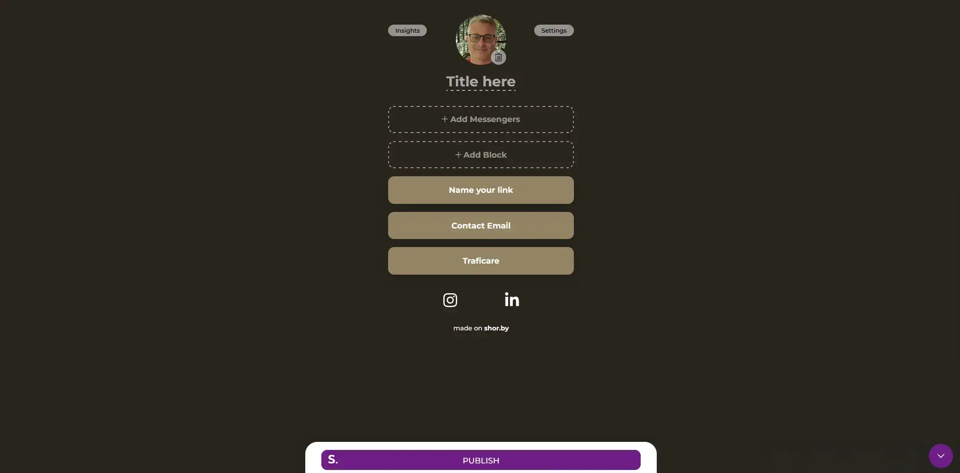
Now that I've finished adding all my details and links to my profile, it's time to style it up. I accessed the Settings and Style pop-up by clicking on the "Settings" button and then on "Theme." It then presented me with a palette of 30 colors.
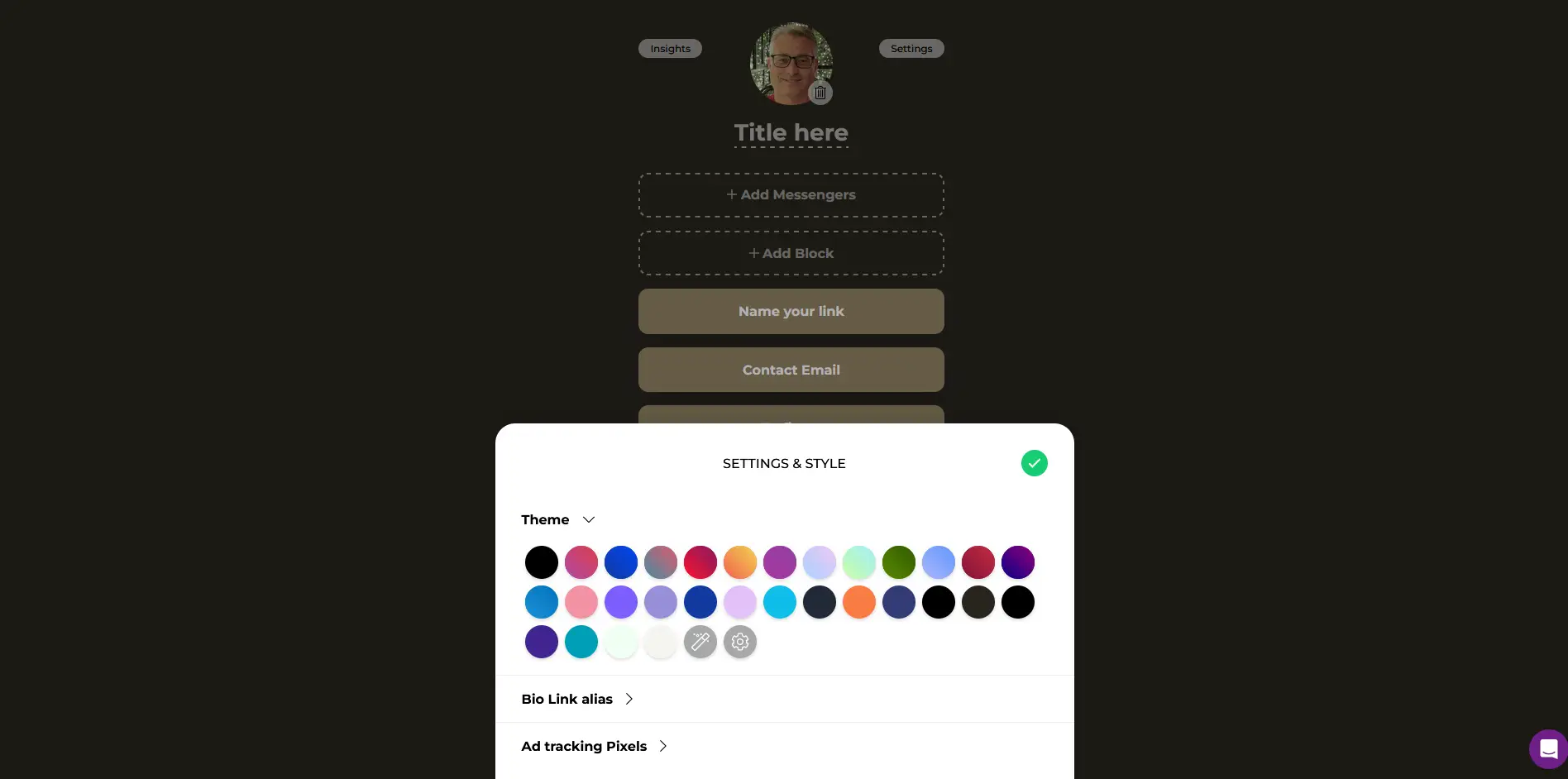
Here's a tip: if you feel overwhelmed by these choices or your creative juices aren't flowing, you can just click on the "I'm feeling lucky" button, which I also used. It's the one with the magic wand. I explored it a bit and found that each click assigns a new pre-designed theme to my profile. After around 10 clicks, I was able to find the right color combination.
Time to register (wait, I don't have an account yet?)
After choosing my preferred theme, it was time to register. Here, I realized that I hadn't actually signed up for an account yet, so technically, I'm just starting and the initial step was to set my bio link alias or username. This section is still under the "Settings & Style" pop-up.
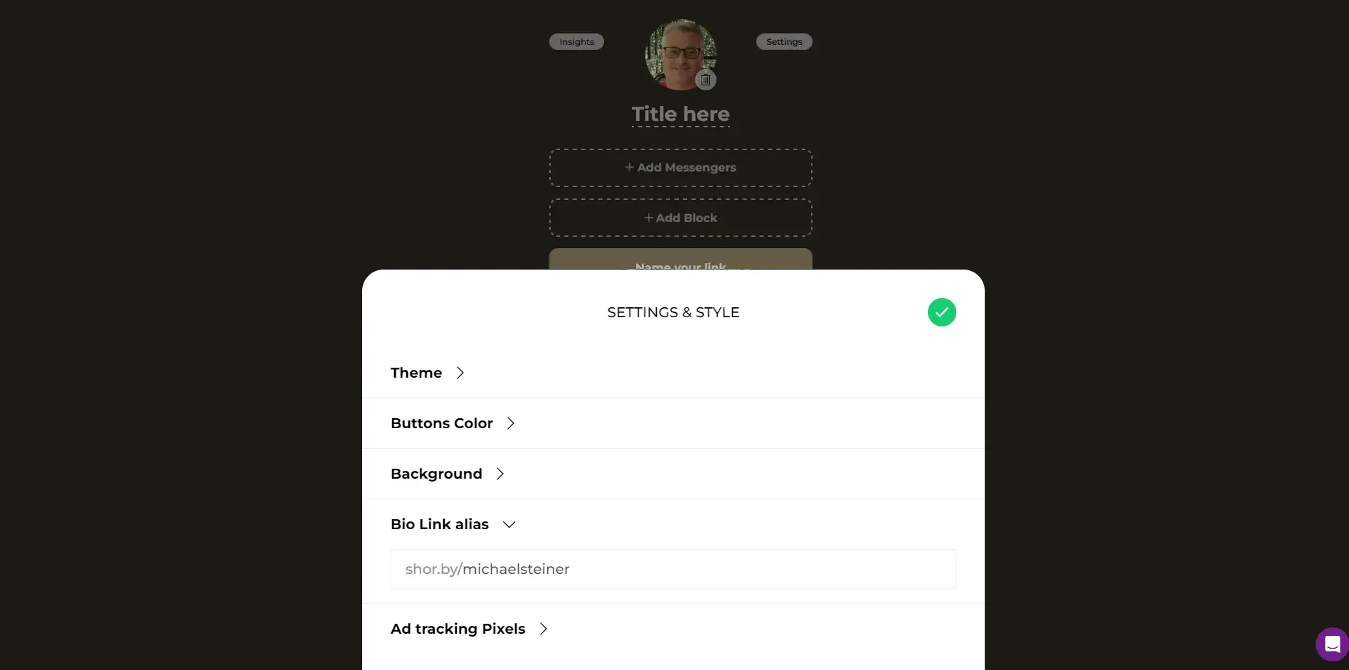
Just after that, I clicked on the purple "Publish" button to proceed.
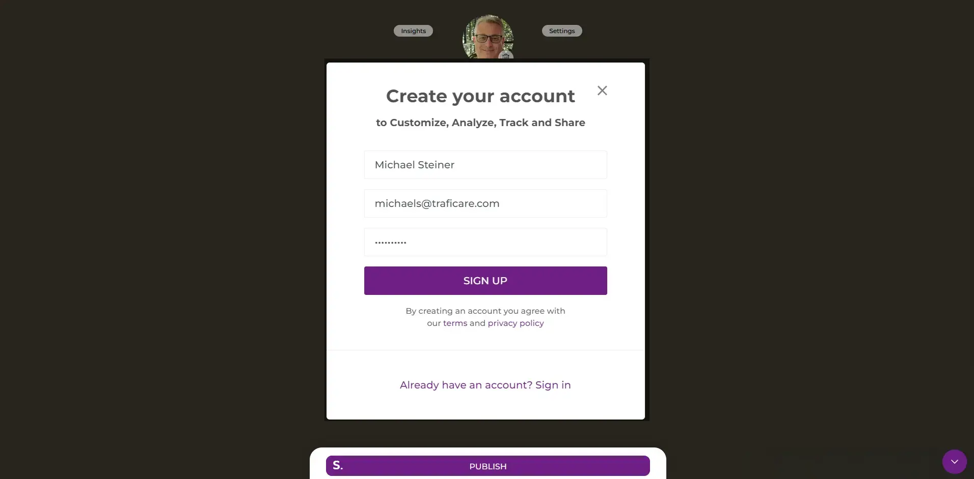
This then launched the online registration form where I was asked to provide my name, email address, and password.
There it is: my Shorby link in bio, all set
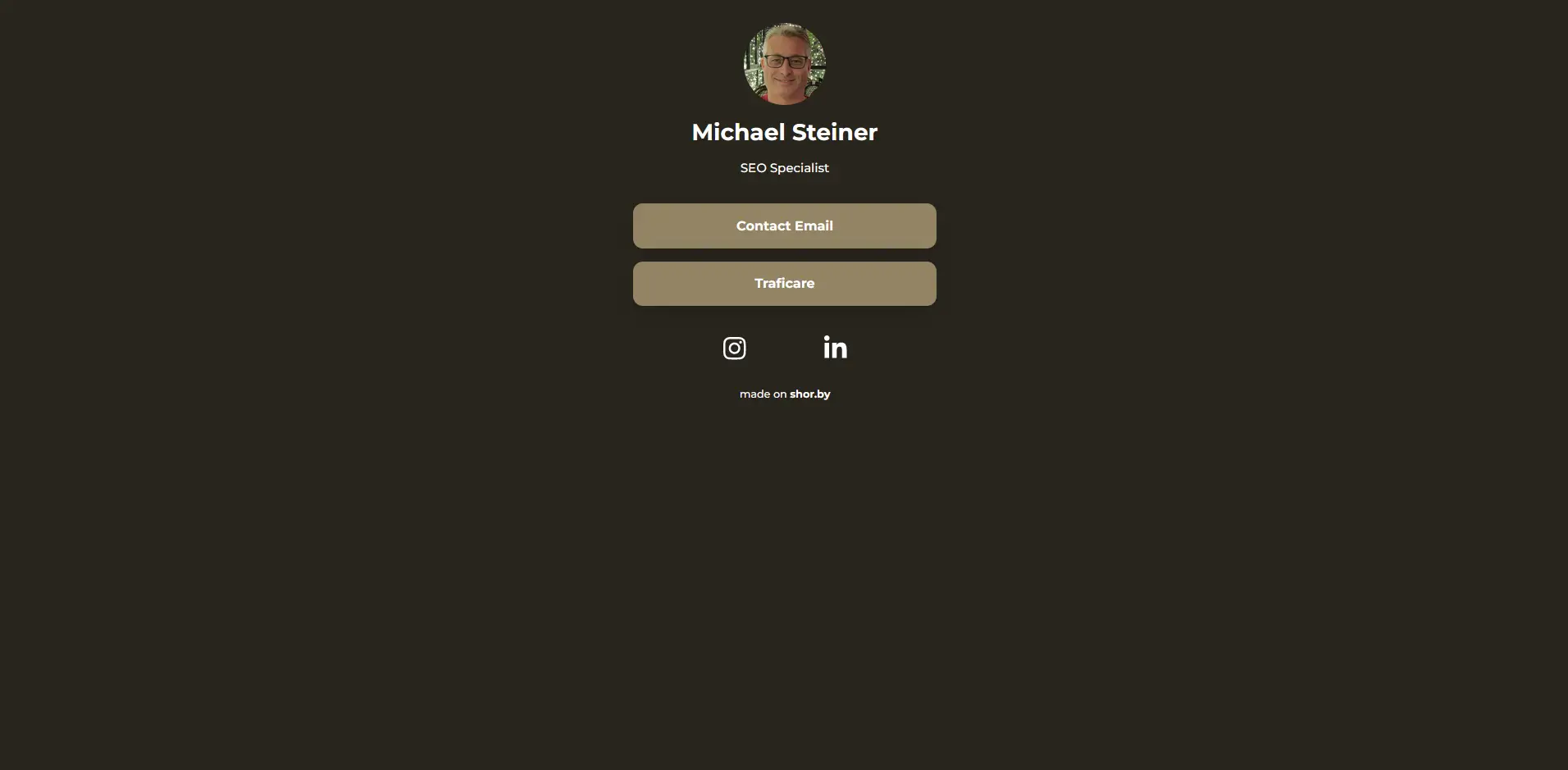
Finally, my bio link page is now live. You can go ahead and access my profile here: shor.by/michaelsteiner
Here's a screenshot of how my link in bio page appears when accessed using a web browser on a desktop:
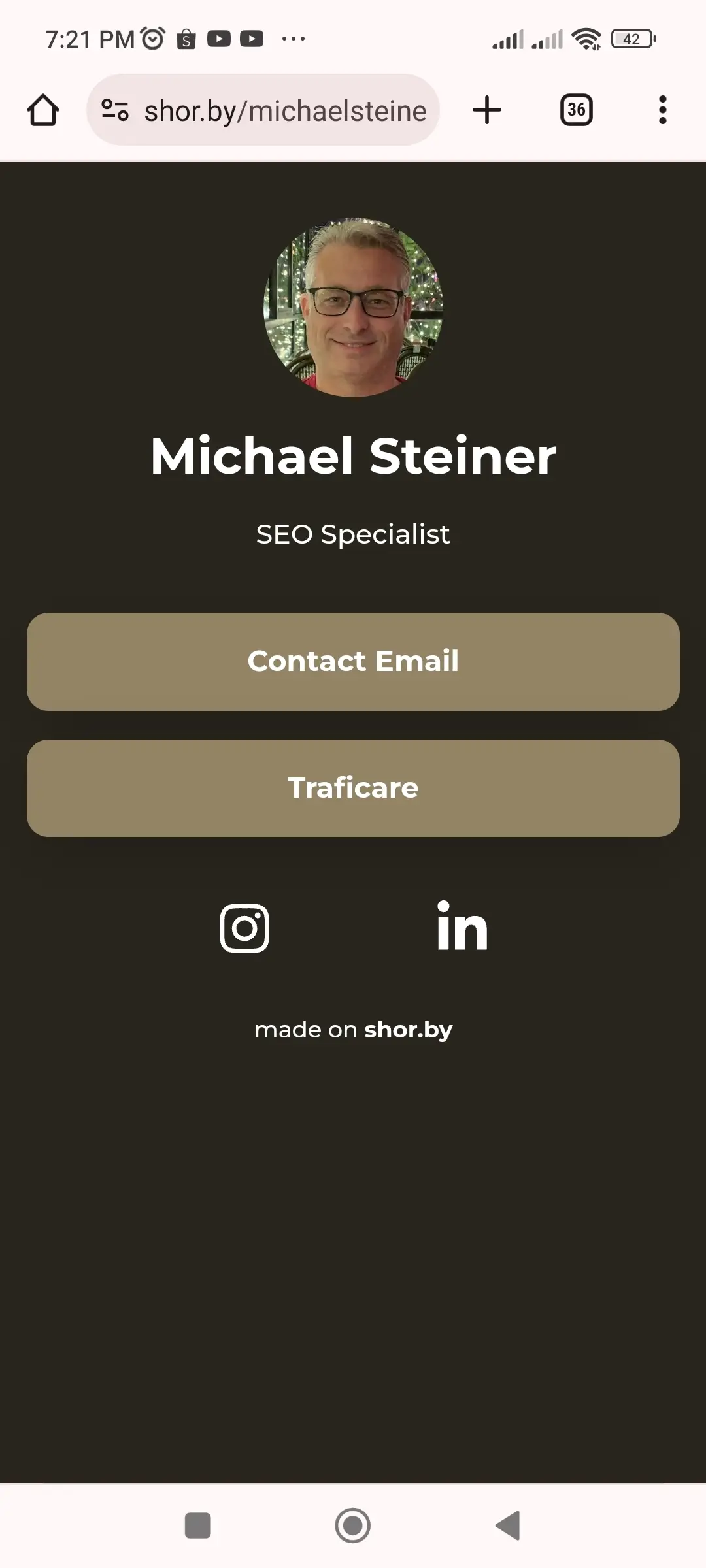
On mobile phones, it also looks great. Here’s a screenshot I took from my Android smartphone:
Insights (analytics) is only available for 5 days unless I upgrade
I find Shorby's analytics, which they label as "Insights," to be quite basic. This can be a drawback if you're a power user needing detailed insights into link performance. I was only able to see the number of clicks, but the lack of depth in analytics might be a limitation for those who need to track engagement more thoroughly.
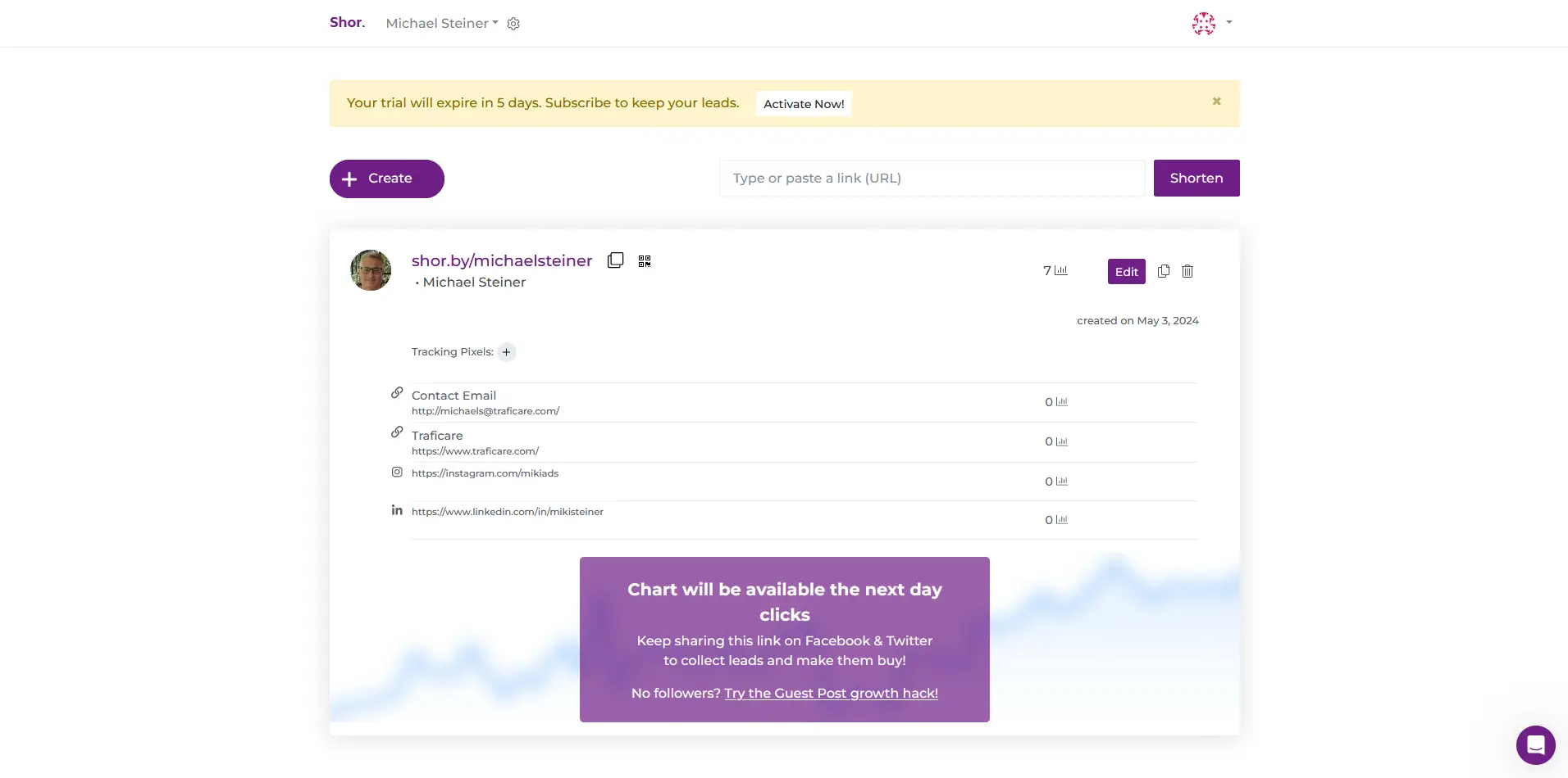
Another downside of this feature is that I will only get to enjoy it for five days. After that, I'll need to activate a paid plan (more on that in the next section).
After a 5-day free trial, some features are restricted
It's important to note that while there is a free plan, certain features become unavailable after the 5-day trial period ends.

The free package comes with basic features, and while I wasn't required to pay for a premium, the catch is that my profile will have "made on shor.by" text at the bottom of the page. It's not that big anyway and has no negative effect on the design, so I believe this is already a good deal. For the premium plans, they offer three choices: Rocket, Pro, and Agency. Check out the table below to know the cost of each plan, both monthly and annually.
| Shorby Plans | Cost (Monthly) | Cost (Yearly) |
| Rocket | $12 | $144 |
| Pro | $24 | $228 |
| Agency | $82 | $1188 |
Their customer support is just the same as the others
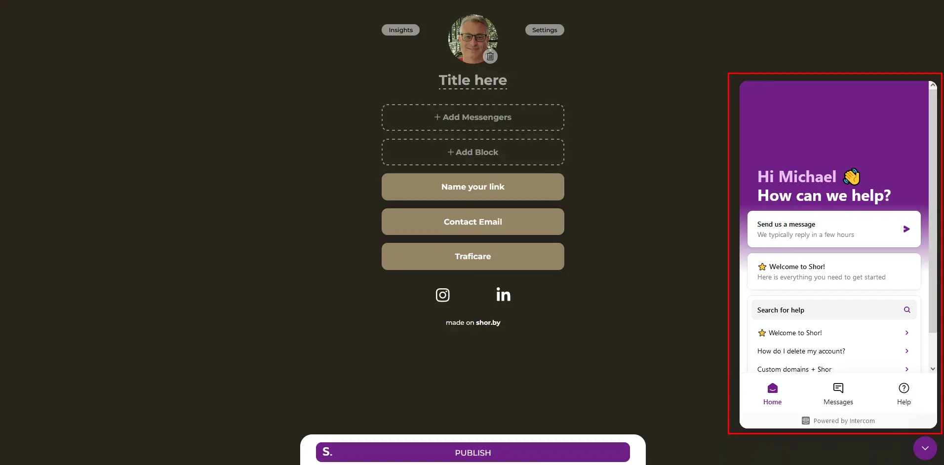
Shorby has customer support resources such as their Help Center and FAQ page. Additionally, the dashboard also includes a shortcut to their customer support pop-up window, which looks very much the same as those on other link-in-bio sites I've tested, including Linktree, Taplink and Tap Bio. They look so identical, and it wasn't actually surprising because they're all powered by Intercom's AI chatbot.
Pros & Cons
Pros
- Magic wand automatically picks a theme
- Supports various methods to upload a profile photo
- Creative elements from the Blocks feature are very handy
Cons
- Free trial ends after 5 days
- Insights (anaytics) is very basic
- Customer support platform is similar with other brands
My Verdict
So, would I recommend Shorby? Yes, but only for users who need a straightforward link in bio platform that gets the job done with minimal setup time. However, if you're a power user who's looking for deep customization or detailed analytics, then you might want to explore other options that cater more effectively to those needs.


